Unbounce Forms: Maximise Your Conversion Rates In 2023
In this comprehensive guide to Unbounce forms, we’ll guide you through creating your first Unbounce form – as well as sharing best practices for high-converting form design.
We’ll also cover setting up email notifications for form submissions, integrating Unbounce forms with third parties and common mistakes to avoid.
This guide will not only walk you through the basics of setting up an Unbounce form, but will help you push your conversion rates further, thanks to our advanced tips!
Table of Contents
Introduction to Unbounce Forms
As you probably know by now, the Unbounce builder allows marketers and businesses to create and optimize landing pages, popups, and sticky bars. It’s a leading landing page builder and CRO platform, with good reason.
One of the essential features of Unbounce is its ability to create custom forms that can be easily embedded right into your Unbounce page.
These forms can help you collect crucial data from your visitors, such as contact information, preferences, and more, which can be used to better understand their needs, preferences, and interests – or just collect leads!
Unbounce forms are nice and customizable, allowing you to create forms that perfectly match your brand and style. Moreover, you can easily integrate Unbounce forms with popular CRM and email marketing tools, streamlining your lead generation and nurturing process.
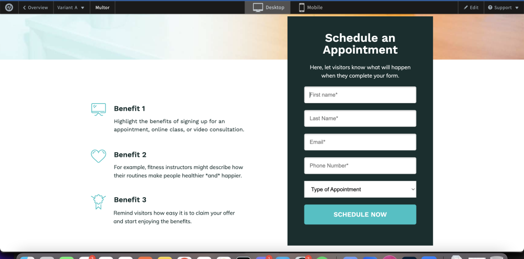
The Importance of Getting Unbounce Forms Right
An attractive and user-friendly form will encourage more visitors to complete and submit it, ultimately driving higher conversion rates – and more money in your pocket.
It’s not just about boosting conversion rates, though – a well-designed form can also help you capture data that is more relevant and detailed from your potential customers, allowing you to tailor your marketing efforts and improve your overall customer experience.
Many Unbounce users forget the importance of lead quality, but when you put yourself in the shoes of a business owner, having detailed and relevant information about your prospects is just as important as quantity.
Types of Unbounce Forms: Single Step vs Multi-Step Forms
There are two main types of Unbounce forms: single step and multi-step. Each type has its unique benefits and use cases.
Single Step Forms
A single step form is the “standard” type of Unbounce form. It consists of a single page with all the required fields that the user needs to fill out. This type of form is ideal for simple data collection, such as newsletter signups.
Multi-Step Forms
Multi-step forms are designed to break down more complex forms into smaller, more manageable sections.
By dividing your form into multiple steps or pages, you can make it much more visually appealing and less overwhelming for your visitors.
This can boost conversion rates by up to 100%, and you’ll have more leeway to ask more questions and gather more valuable information from your users.
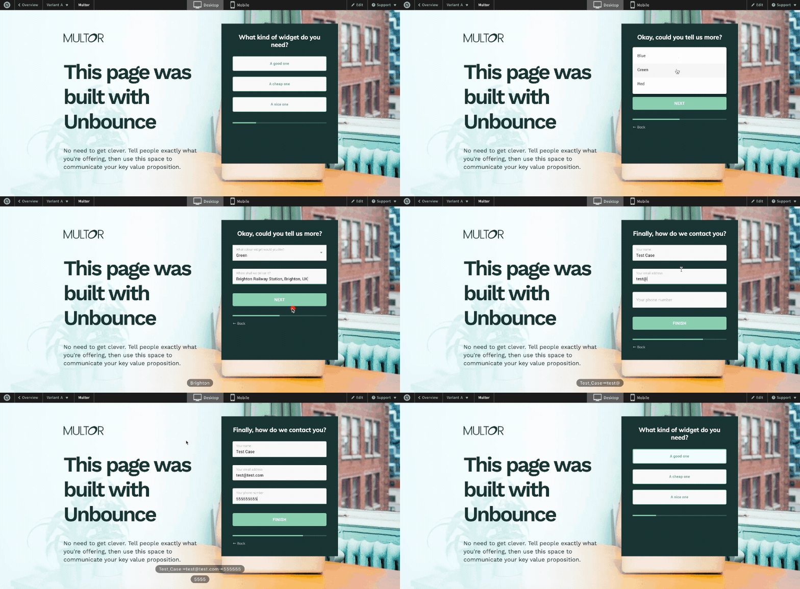
How to Create a Unbounce Forms
How to Create an Unbounce Single Step Form – Step-By-Step Guide
Adding a simple form to your Unbounce page is possible in a few simple steps.
In this section, we’ll walk you through the process of creating an Unbounce form from scratch.
- Log in to your Unbounce account: If you don’t already have an Unbounce account, you can sign up for a free trial and create your first form.
- Create a new Unbounce landing page: To add an Unbounce form, you’ll need an Unbounce page first! Click on the “Create New” button, and choose whether you want to create a landing page, popup, or sticky bar. Then, select a template or start from scratch.
- Add a form widget: Once you have created your landing page or popup, drag the “Form” widget onto your page from the left-hand side. Some landing pages include a form already – if so, just use that one!
- Customize your form fields: To edit your fields, hit “Edit form fields” whilst the form is selected. From here, you can add, remove, or edit form fields as needed. You can add hidden fields here too – just select “hidden field” from the list of field types.
- Customize look and feel: While the form is selected, you can also edit the appearance of your form and change the forms option properties like font, colors, and more.
- Set up form submission actions: In the form editor, click on the “Form Confirmation” tab to specify what should happen when a user submits your form. You can choose to display a thank-you message, redirect the user to another page, or trigger a custom event.
- Configure email notifications: If you want to receive an email notification whenever a user submits your form, hit “Overview” in the top-left corner of the screen to return to the landing page’s Overview tab. Then, hit the “Integrations” tab and under “Native integrations”, hit “Email notifications”. From here, you can configure the form to email you whenever a lead is received.
- Integrate with third-party tools: If you’d like to connect your Unbounce form to a CRM or email marketing tool like Hubspot or Salesforce, follow the steps in step 7, but choose “Powered by Zapier”. Then, choose your CRM or marketing tool and follow the instructions.
- Save and publish your form: Once you have finished customizing your form and setting up your desired submission actions, click on the “Save” button in the top-right corner of the screen. Then, click on the “Publish” button to make your form live and ready to collect submissions.
How to Create an Unbounce Multi Step Form
Thanks to Unbounce’s “custom HTML” widget, it’s possible to easily drag HTML generated from other tools into your Unbounce landing page.
To create a multi-step form for your Unbounce page, you can use Growform, #1 tool to build multi step forms.
As well as adding multi-step form design capability, Growform also adds conditional logic, validation, tracking capabilities and hidden field support. Best of all, you can even track conversions inside Unbounce!
Read the full guide to creating a multi step form in Unbounce.
Best Practices for Designing High-Converting Unbounce Forms
To maximize the effectiveness of your Unbounce forms, it’s important to follow conversion rate optimization best practices. In this section, we’ll walk through some of the best practices to help you create forms that not only look great but drive high conversion rates.
Keep it Simple
One of the most important principles of form design is simplicity. Avoid overwhelming your visitors with too many fields or complex layouts. Stick to the essential information you need to collect, and break your form down into smaller sections if necessary.
As a very general rule, most forms have 4-6 fields. Any more than 10 and you should start looking for fields to trim.
Use Clear and Concise Labels
Your form labels should be clear and concise, so users can easily understand what information is needed. Avoid using jargon or technical language and opt for simple, everyday terms that your visitors will understand.
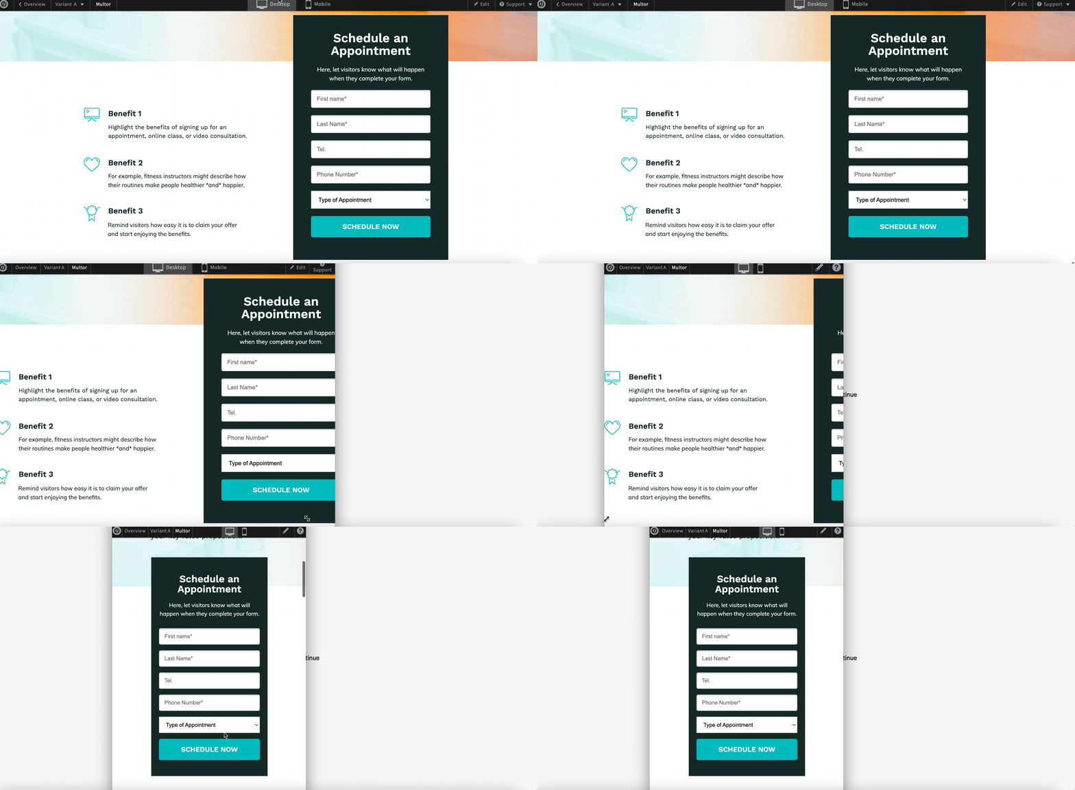
Good (“Phone number” is clear and obvious):

Bad (“tel” is a well known but slightly difficult abbreviation):

Make Use of Placeholder Text
Placeholder text can be a helpful way to provide additional guidance to users about what information they should input. Use placeholder text sparingly and only when it adds value to the user experience.
Design for Mobile Devices
With the majority of web traffic now coming from mobile devices, it’s essential to design your Unbounce forms with mobile users in mind. Of course, Unbounce has 2 views: desktop and mobile – so be sure that these look great on both devices.
Utilize Visual Hierarchy
Visual hierarchy is crucial in guiding users through your form. Use clear headings, bold text, and contrasting colors to differentiate between sections and highlight important information.
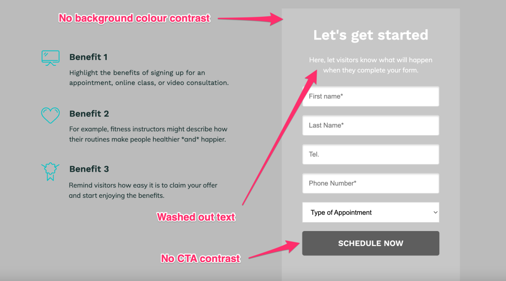
Use contrasting colors to the rest of the page and ensure your text and CTA stands out properly.
Here’s an example of how not to design your form:
Use the right form fields
It’s important to match the type of form field with the data you’re asking for.
For instance, a phone number field should only accept numeric input, and an email address field should accept only valid email formats. Using the right input types for each field will ensure that users can enter data easily and accurately, minimizing the chance of errors and improve the user experience.
Test and Iterate
Finally, don’t be afraid to test different form designs and gather feedback from your users. Regularly analyze your form’s performance, and make data-driven decisions to optimize your form for maximum conversions.
If you’re getting enough traffic to reach statistical significance, you can use Unbounce’s A/B testing tools to
Common Unbounce Form Mistakes to Avoid
To ensure the success of your Unbounce forms, it’s essential to avoid common mistakes that can negatively impact your conversion rates. Here are some of the most common mistakes to watch out for:
Asking for Too Much Information
Asking for too much information can overwhelm your visitors and lead to lower completion rates. Stick to the essential information you need to collect, and only ask for additional information if it’s necessary for your business goals.
Poor Form Layout and Design
A poorly designed form can be confusing and frustrating for users, leading to lower conversion rates. Make sure your form is visually appealing and easy to navigate, with clear labels and a logical layout.
Form getting “lost” on the landing page
The prominence of a form on the landing page plays a crucial role in its effectiveness. An easily identifiable form stands out from the surrounding content, ensuring that visitors don’t overlook it among other design elements.
This visibility is essential for maximizing conversions, as visitors are much more likely to engage with a form that is immediately noticeable and accessible.
Lack of Trust Signals
Trust signals, such as security badges or social proof, can help to build trust with your visitors and increase the likelihood that they will complete your form. Make sure to include relevant trust signals throughout your forms and landing pages.
Using complicated custom JavaScript and hacks
We’ve seen all sorts of JavaScript being added to Unbounce pages over the years – designed to do everything from rearrange field layouts to hack together multi step forms.
Avoid using complicated code from online forums if you’re not sure what it does – becomes very difficult to maintain and is easy to get wrong.
Unbounce Form FAQs
Can you have two forms in Unbounce?
No, Unbounce doesn’t provide a built-in way to include more than one form on a single page. However, this is possible using a third party form builder like Growform. With this, you can add as many different forms as you wish to a landing page, each with its own conversion goals and actions.
How can I embed a form in Unbounce?
To embed a form in Unbounce, first create your form using a third-party form builder and copy the code generated.
Next, log in to your Unbounce account and navigate to the landing page where you want to embed the form. Within the Unbounce page builder, drag and drop a “Custom HTML” widget onto your page where you want the form to appear.
Click the widget and paste the embed code or HTML code of your form into the “Edit HTML” area. Save your changes and publish the page. Don’t forget to check the mobile view looks good too!
How can I create conditional logic forms in Unbounce?
To create a conditional logic form (where fields show and hide dynamically based on previous inputs), you’ll need to use a third party form builder. We’re biased, but of course, we’d recommend our own form builder…
Introducing Growform, a better form builder
So, you’ve created a form that fits into your Unbounce landing page’s design and collects just the right amount of information – nice!
If you want to level up your form game even further, check out Growform, the #1 multi step form builder:
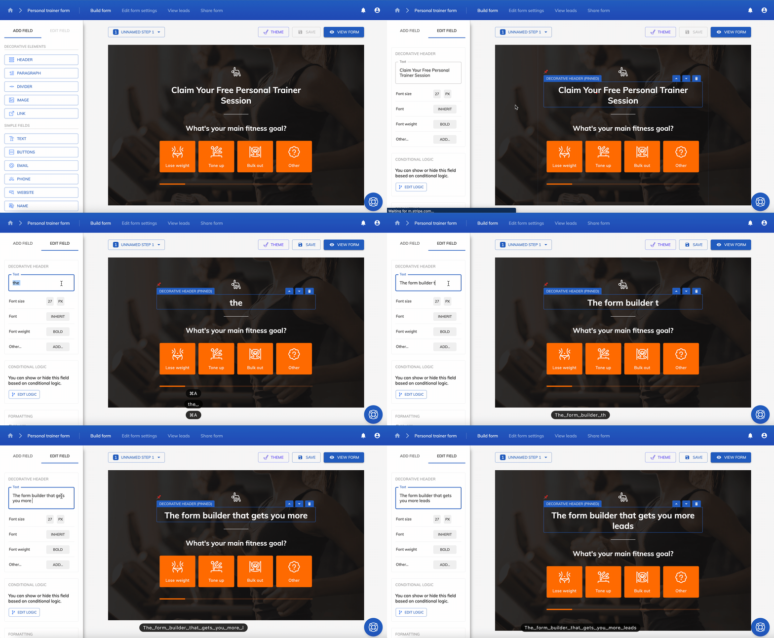
Growform makes it easy to create beautiful forms for Unbounce, bringing advanced possibilities such as multi-step form design, conditional logic forms, hidden fields and more.
To get started, begin your 14 day free trial and follow the Unbounce tutorial here.
Recent Posts
- A Complete Guide to Form Validation for Better User Experience
- Mastering Lead Scoring for Better Sales
- What is Bottom of Funnel in Marketing? Here are Our Top Strategies for Success
- What Is Lead Enrichment? Our Complete Guide to Enhancing Your Lead Data
- How To Send Conversions To Facebook/Meta via Conversion API (CAPI)
