The Magic of Wizard Forms: How To Create A Wizard Form
There’s a good chance you’ve encountered a form with countless fields, irrelevant questions and hundreds of fields per page. These forms can be daunting and frustrating, often leading to a poor user experience and low completion rates…
Enter the wizard form.
A wizard form, or form wizard, is a powerful tool that can transform a lengthy, complex form into a streamlined, user-friendly experience:

In this article, we’ll discover the charm of these multi step forms, showcasing their benefits, components, and how to create one step-by-step. We will also delve into best practices for designing wizard forms and share examples of effective wizard forms.
Finally, we will demonstrate how to create your very own wizard form with multiple steps using Growform. Let’s embark on this magical journey of creating wizard forms!
Table of Contents
What is a wizard form?
A wizard form is a type of online form that breaks down a complex process into smaller, more manageable steps.
Rather than presenting users with an overwhelming number of fields and questions at once, a wizard form guides users through the process step-by-step. Each step focuses on a specific set of related questions, and users can navigate between steps using next and previous buttons.
This approach makes it easier for users to understand and complete the form, leading to higher completion rates and a more enjoyable user experience.
In addition to simplifying forms and improving user experience, the form wizard format also offers several other benefits.
For example, they can help reduce errors by validating user input at each step and providing immediate feedback.
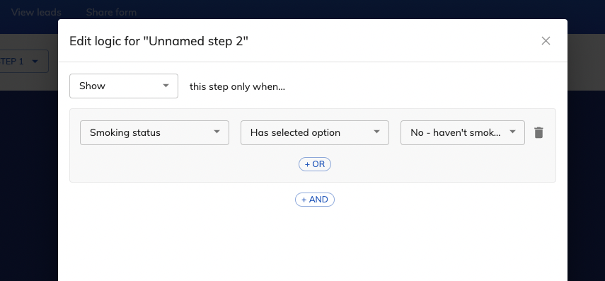
Using conditional logic, they can be configured to show or hide certain steps based on user responses, creating a more personalized and relevant experience for each user:
Why is it called a wizard form / form wizard, anyway?
The term “wizard” in software design was popularized by Microsoft in the early 1990s with the introduction of their Windows operating system:
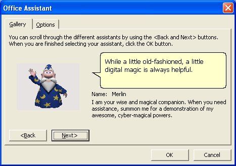
A wizard would guide untrained users through a series of steps, breaking down complicated tasks into smaller, more manageable segments. Similarly, a wizard form breaks down a long or intricate form into a series of simpler steps, making it more accessible and user-friendly. Now we know!
Benefits of using wizard forms
There are several reasons why you should consider using a wizard form instead of a traditional form:
- Improved user experience: By breaking down complex processes into smaller steps, wizard forms make it easier for users to understand and complete your form. This leads to a more enjoyable user experience, higher completion rates and more form data.
- Reduced errors: Wizard forms can validate user input at each step, providing immediate feedback and helping users correct any mistakes before they move on to the next step. This reduces the likelihood of errors and ensures that you collect accurate data.
- Increased engagement and higher conversion rates: Wizard forms create a sense of progress and accomplishment as users complete each step. This can motivate users to continue filling out your form, leading to higher engagement and completion rates.
- Personalization: Wizard forms can be customized to show or hide certain steps based on user responses, creating a more personalized and relevant experience for each user. This can increase user satisfaction and help you collect more targeted data.
- Ease of use: By breaking down complex processes into smaller steps, wizard forms make it easier for users to navigate your form, even on mobile devices. This can lead to higher completion rates and a better overall user experience.
Components of a successful wizard form
Although a good wizard form builder will ensure each of these components are in place, it’s worth pointing out the key components of a wizard form in case you plan to design it yourself:

- Clear and concise steps: Each step in your wizard form should focus on a specific set of related questions or tasks. This helps users understand the purpose of each step and makes it easier for them to complete your form.
- Progress indicators: Displaying a progress bar or step indicator can help users understand how far they’ve come and how much is left to complete. This creates a sense of progress and accomplishment, motivating users to continue filling out your form.
- Navigation buttons: Providing next and previous buttons allows users to navigate between steps easily. Make sure these buttons are clearly labeled and easy to use, even on mobile devices.
- Validation and feedback: Validating user input at each step and providing immediate feedback can help users correct any mistakes before they move on to the next step. This ensures that you collect accurate data and reduces the likelihood of errors.
- Responsive design: Your wizard form should be easy to use on any device, including smartphones and tablets. A responsive design ensures that your form looks and functions well on all screen sizes and devices.
Examples of when to use a wizard form
Wizard forms come into their own when you’re asking lots of information that could be broken down into a number of steps. The following are great examples of when to use multi step forms / wizards rather than “traditional” single step forms:
- Event registration: An event registration form can be broken down into steps such as personal information, event preferences, and payment details. This makes it easier for users to complete the form and reduces the likelihood of errors.
- Job application: A job application form can be broken down into steps such as personal information, education, work experience, and references. This allows users to focus on one aspect of their application at a time, making it easier for them to complete the form.
- Survey: A lengthy survey can be broken down into steps based on topic or question type. This helps users focus on one set of questions at a time and makes it easier for them to complete the survey.
- Onboarding flows: A long onboarding process can be reduced down to several steps to make the process more appealing to new, perhaps less motivated users.
Examples of when *not* to use a wizard form
While wizard forms can be beneficial for complex or lengthy processes, there are certain situations when they may not be the best choice.
Here are some examples of when not to use a wizard form:
- Simple forms: If a form requires only a few fields, such as a basic contact form or newsletter subscription, using a wizard form can be unnecessarily complex and may deter users from completing the form. In such cases, a single-page form is more appropriate.
- Time-sensitive tasks: For tasks that require users to quickly fill out and submit information, such as in emergency situations or time-sensitive contests, a wizard form may slow down the process. In these instances, a single-page form with clear instructions is more suitable.
- Frequent users: If the form is intended for users who will be frequently interacting with it, such as internal employees or regular customers, a wizard form may become tedious over time. A single-page form with a clear layout may be more efficient for these users.
Best examples of wizard forms
Example 1: Nearly Real Florals
This beautiful example of a wizard form by Nearly Real Florals seamlessly collects address and contact details for the user, giving the florist enough information to generate a quote:

Example 2: Boxt Boilers
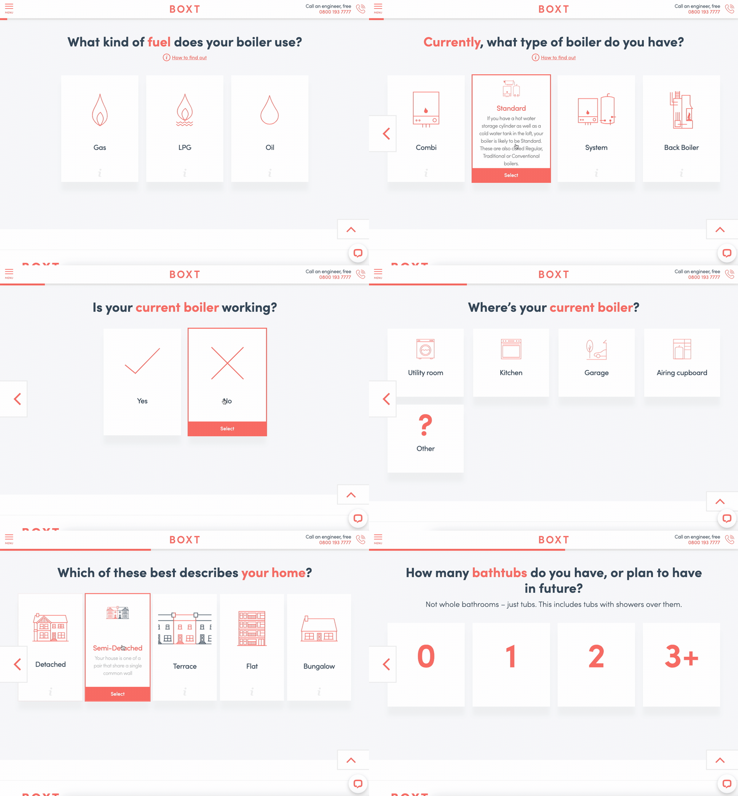
This wizard form by Boxt makes the experience of ordering a new boiler almost enjoyable, with a conversational spin. The user is seamlessly taken from the first page to the second page just by pressing one of the button.
Notice the elements we covered earlier: questions are grouped logically, there’s a clear progress bar and the user can navigate between steps:
For more examples of 20+ wizard forms, check out this template library.
How to create a wizard form using Growform
Growform is an online form builder that makes it easy to create visually appealing and responsive wizard forms:

- Sign up for a Growform account: Sign up for a free 14 day trial here.
- Create a new form: Once you’re logged in, click on the “Create New Form” button to start building your wizard form.
- Choose a template: Growform offers a variety of pre-built wizard form templates to help you get started. Select a template that best fits your needs, or choose a blank template to build your form from scratch.
- Add steps to your form: In the top-left corner, use the drop-down menu to add and reorder steps to your preference.
- Customize your form: Use the built in editor to add and edit fields to your form. Use the “theme” settings button on the right-hand side to design, layout, and colors to match your brand.
- Publish your form: Once you’re satisfied with your form, click the “Save” button to make it live. Under “Share form”, you can get a unique URL for your form, as well as embed code to add it to your website.
Conclusion & next steps
As we’ve seen, wizard forms are an invaluable tool for simplifying complex processes and improving the overall user experience. By breaking down lengthy forms into smaller, more manageable steps, they can help you increase engagement, reduce errors, and achieve higher completion rates.
Now that you understand the benefits, components, and best practices of wizard forms, it’s time to put your knowledge into action.
Why not try Growform to create a visually appealing and user-friendly wizard form for your next project?
Whether you’re designing an event registration form, a job application, or a survey, a well-crafted wizard form can make all the difference in capturing accurate form data and ensuring a positive experience for your users.
Recent Posts
- Our Top Picks for Real Estate Lead Generation Companies to Boost Your Business
- How To Send Conversions To Facebook/Meta via Conversion API (CAPI)
- Top 9 Lead Distribution Software to Maximize Sales Efficiency and Conversion
- Our Ultimate 7-Step Lead Qualification Checklist for Sales Success
- We Share Our Top Strategies to Help You Generate More Web Design Leads
