Must-Follow UX Best Practices When Designing A Multi Step Form
February 2025 update: We’ve added new tips and brought this post up to date to reflect new best practices.
Table of Contents
Quick Summary
In this guide, we explore the best UX practices for designing multi-step forms, including removing unnecessary fields, using progress indicators, and optimizing question order. We also compare multi-step vs. single-step forms and highlight their benefits. By the end of this article, you’ll be equipped with actionable strategies to create engaging and effective multi-step forms.
Don’t Know Where to Start When it Comes to Designing a User-Friendly Multi Step Form?
You’re not alone. In this comprehensive guide, we’ll reveal the critical UX best practices for multi step form design, gleaned from years of experience in conversion rate optimization, paid marketing, and form design.
These insights will transform your form into an engaging, user-friendly experience that not only looks great but also performs exceptionally well.
We’ll delve into the ideal number of fields for optimum user engagement, explore the most important form elements to prioritize, and discuss how to order your form questions for maximum conversions.
We’ll share expert tips on providing users with clear instructions, incorporating progress indicators, and implementing validation techniques to minimize errors and ensure a smooth user experience.
By the end of this post, you’ll have a thorough understanding of the key components of successful multi step form design and will be well-equipped to create an engaging and user-friendly form that keeps your users progressing. So, let’s dive in and start transforming your multi step form into a conversion powerhouse!
What Is a Multi-Step Form?
A multi-step form is an online form that breaks user input into multiple steps or pages instead of displaying all fields at once. By organizing questions into logical sections, this approach simplifies the process, making it easier for users to complete without feeling overwhelmed.
Multi-step forms are effective because they leverage progressive engagement and commitment psychology. Presenting one step at a time reduces cognitive load and keeps users focused. Each completed step reinforces a sense of progress, increasing the likelihood of form completion and improving conversion rates, especially for longer or more complex forms.
Example of a Multi-Step Form
A great real-world example of an effective multi-step form is Neil Patel’s “Want More SEO Traffic?” landing page form.
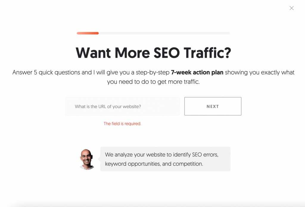
Neil Patel, a marketing powerhouse, ensures every visitor has a compelling reason to engage. His team offers a 7-week SEO action plan, delivered straight to the user’s inbox, making the form feel valuable rather than intrusive.
The first step asks for a website URL, an easy, low-friction request that feels natural since it’s required for the free report. Throughout the process, the form subtly reinforces the benefits users will receive, while every data request is clearly justified.
With Growform’s multi-step form builder, creating forms like these is effortless. Our platform offers a library of beautifully designed templates, ready to be customized to fit your needs.
Multi-Step vs. Single-Step Forms
- Single-step forms present all fields at once, making them ideal for quick, low-effort data collection. However, they can feel overwhelming for users, especially with complex forms.
- Multi-step forms, on the other hand, break the process into smaller, manageable sections. This reduces cognitive load and increases the likelihood of users completing the form. With each completed step, users gain a sense of progress, motivating them to continue. Multi-step forms are especially effective for gathering more detailed information while keeping the process user-friendly.
For lead generation, multi-step forms are often the best choice, helping capture better-qualified leads while minimizing form abandonment.
Benefits of Multi-Step Forms
Using a multi-step form can provide numerous advantages:
Higher Completion Rates
Users are less likely to feel overwhelmed when forms are broken down into multiple steps. By presenting one section at a time, multi-step forms make the process feel easier and more approachable, leading to higher completion rates.
Improved Data Accuracy
When users fill out a long form all at once, they may rush through it, leading to errors or incomplete responses. Multi-step forms segment information logically, making it easier for users to provide accurate details, which improves data quality.
Enhanced User Experience
A structured, guided form experience creates a smoother and more intuitive journey for users. Adding progress indicators, clear CTAs, and easy navigation ensures users feel in control throughout the process, reducing frustration and abandonment.
Better Lead Qualification
By gradually collecting relevant information, multi-step forms allow businesses to pre-qualify leads. Instead of capturing incomplete or irrelevant data, businesses can filter out low-intent users and focus on high-value prospects.
Mobile-Friendly Design
Breaking forms into smaller, digestible sections improves usability on mobile devices. Since mobile users often struggle with long forms, a step-by-step approach enhances accessibility and engagement, leading to better conversion rates.
Essential UX Best Practices to Follow When Creating Multi-Step Forms
8. Remove All Non-Essential Fields
Conventional wisdom holds that the shorter the form, the more conversions you’ll generate.
But as with so much conventional wisdom, it’s questionable whether or not it’s actually true.
A landmark study from HubSpot discovered there’s actually a relatively shallow decline in conversion rates when more fields are added to forms. What’s more, forms with 2 – 5 fields convert better than those with just a single field:
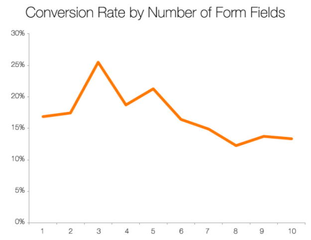
And in another study, Unbounce found that reducing the number of form fields led to a 14% drop in conversions.
So forms with multiple fields can actually convert better than their single-field alternatives. Not only that, but adding more fields helps you capture more detailed information, which can improve lead quality.
So what’s the balance? What’s the right number of fields to have in a multi step form?
Simply put, if you don’t absolutely need to capture a certain piece of information about your leads, don’t ask for it.
For instance, if you only follow-up with leads via email, don’t bother asking for a phone number too.
The benefits of being strict with your multi-step form design are highlighted by a study from Norwegian ecommerce firm BliVakker, which tested the impact of stripping unneeded form fields. It tested three different form versions:
- Control: The original form, containing 17 fields
- Skjema-Light: The original form, but stripped of three fields –– account number, phone number, and evening phone number
- Skjema-Uberlight: An even more pared-back form with fewer fields and navigational elements
Now, conventional wisdom suggests the snappily titled Skjema-Uberlight should come out on top. But in reality, Skjema-Light took the crown, boosting conversions by almost 11%:
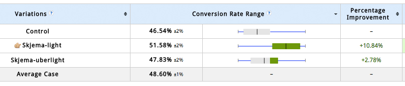
Having run the test and crunched the numbers, BliVakker concluded that reducing the number of unnecessary fields will increase conversions –– but also that stripping out too much information can actually harm performance.
The takeaway here is to start with relatively few fields (we recommend around 5-6, and usually no more than 10), and then test your way to incorporating more fields as required.
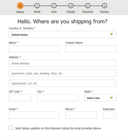
7. Avoid Multiple Columns
There’s a time and a place for multiple columns.
If you’re an Ancient Greek architect, go mad –– the more columns, the merrier.
But if you’re building a lead capture form, single columns are definitely the way to go, because they’re much easier for users to understand and complete.
UX research experts at The Baymard Institute have declared that multi-column form layouts are “prone to misinterpretation”, often resulting in two common user errors:
- Missing fields, either because they don’t understand the meaning of the multiple columns, or because they simply overlook them
- Completing unrelated or incorrect fields because they believe those steps are required
Here’s a good (or, rather, bad) example of this in action, courtesy of multinational retail giant Walmart:
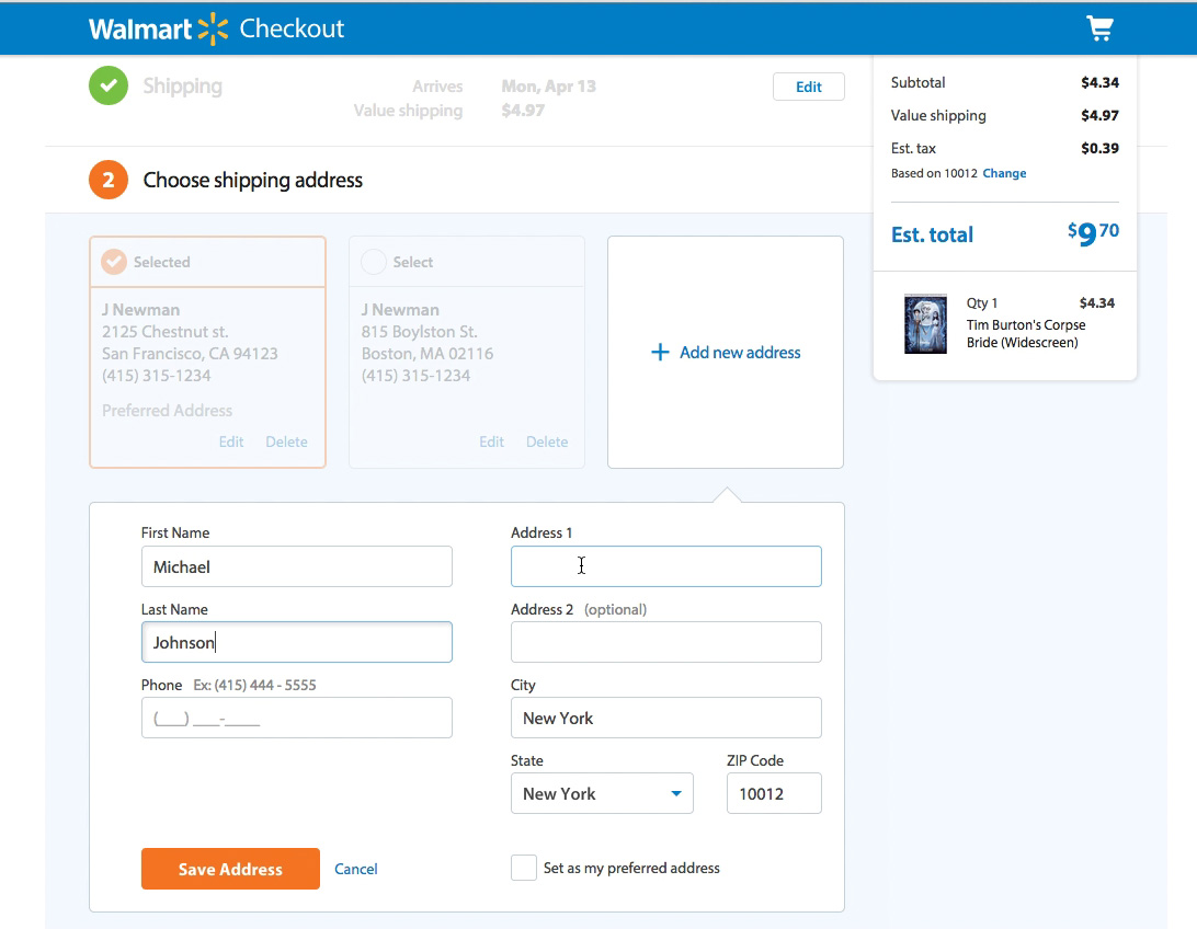
What’s going on here? Well, we can see the user in question has started to fill out column one, adding their first and last names. But then they skipped the phone field completely and jumped straight to column two.
The big problem is that there’s no uniform way for users to misinterpret columns, as Baymard demonstrates:
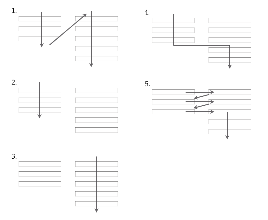
Ironically, that diagram is laid out in columns, and it’s also pretty confusing to look at.
The only thing that’s totally clear is this: if you want to improve your conversion rates, say “no” to multiple columns.
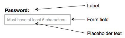
6. Make Use of Labels, Not Placeholders
A form field is just a big empty box.
So it’s kind of understandable that lots of brands opt to fill them up with placeholder text designed to offer useful hints on the information required.
However, that placeholder copy might be doing more harm than good.
To be clear, here’s an illustration of what we’re talking about, courtesy of Norman Nielsen Group (NNG):
Now, you might think labels and placeholders are pretty interchangeable. But according to NNG, user testing has repeatedly demonstrated that substituting labels for placeholder text is more of a detriment than a help to usability, for several reasons:
- Placeholder text disappears when you start typing, so if you forget the “hint”, you have to delete what you’ve already written (or, in some cases, refresh the whole page)
- A lack of labels makes it impossible to go back and check you’ve filled everything in correctly at the end
- If an error message shows up, it’s hard to find out what the problem is
- If you’re navigating with the tab button rather than your mouse, there’s a good chance you won’t even have read the placeholder copy before it gets removed
- Your eyes are naturally drawn to empty fields, so fields containing placeholder copy are easily overlooked
- It’s easy to mistake placeholder text for autocompleted data
- Sometimes, placeholder copy has to be manually deleted, which is particularly irksome
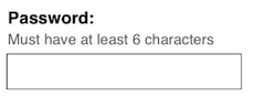
So if standalone placeholder text is a definite no-no, what should you be doing?
It’s simple: use a label, and add a hint outside the form field, like NNG demonstrates here:
5. If You Require a Field, Mark it as Required
Even though you should only be capturing essential information in your multi-step forms, there’s always a chance that some information won’t be as “necessary” as others.
For instance, you might ask for a user’s first, middle, and last names. But what if they don’t have a middle name?
Presumably, you still want them to complete your form. So your best option is to mark the first and last name fields as “required”, and the middle name field as “optional”.
As with so many aspects of multi-step form UX, this might sound obvious, but lots of brands aren’t doing it clearly (or at all).
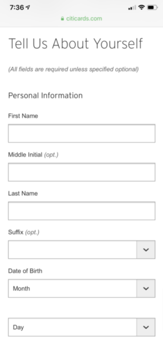
For instance, NNG flags up the following example from Citicards, which features a small –– and easily overlooked –– explainer that all fields are required unless specified:
For the sake of clarity, all required fields should be marked as such –– ideally in the label section, just like UPS does here (note the asterisks):
And to make things even easier for users, consider adding the word “optional” to all optional fields, just like Sephora does:
4. Provide inline validation
By providing real-time feedback as users complete fields, you can significantly reduce errors and simplify the form-filling process. This approach will help your users quickly identify and fix their mistakes, ensuring a smoother and more efficient experience.
When an error occurs, display a clear and specific error message that explains the issue and guides the user towards the correct solution. Avoid validating fields too early, such as when a user is still typing, to prevent frustration. Ideally, validation should occur once the user has completed the field or when they attempt to move to the next step.
With multi-step forms, the temptation can be to wait until the end to validate all fields – but this is a recipe for disaster. By saving all validation to the end, you’ll be guaranteed to frustrate users and lose many in the navigation between steps.
Stuck on validation? Growform makes it easy – try a free 14 day free trial.
3. Use Clear CTAs
Funnily enough, the average internet user has little desire to spend their time filling in forms.
So if you’re going to convince them to hand over their information, chances are you’ll need to point them in the right direction with a clear, compelling call to action (CTA).
When it comes to using CTAs in multi-step form design, there are enough recommendations and best practices to fill an entire article, so this advice is far from exhaustive. But as a general rule, you should:
- Keep your CTAs concise
- Personalize CTAs to individual users or audience segments where possible
- Use action verbs like explore, shop, and learn
- Run regular A/B tests to optimize your CTAs
- Use a different CTA on the last step than on the preceding ones (e.g. steps 1 – 3 might say “Next step”, while the final step says “Get my free quote”)
- Make your CTAs benefit-driven, so it’s clear why the user should click
- Add a CTA button rather than a text link or image
On that final point, make sure your buttons actually look like buttons. They need to stand out and look “clickable”, as demonstrated by GoSquared:

2. Start With Easy Questions First
One of the best things about multi-step form design is that users are only shown the first question –– or handful of questions –– when first presented with your form.
That means there’s no intimidation factor; no reason not to start filling it out.
And it offers an additional benefit too: you can ease users into the process by asking simple, low-friction questions first.
That way, by the time they’re faced with something that requires a little more effort to answer, they’ve already sped through the first few questions. And because it feels like they’ve already made progress, there’s a good chance they’ll keep on going.
Of course, what counts as a “low-friction question” will vary depending on the purpose of your form.
But here’s a good example of a quote request form from Nearly Real Florals, which starts with the question: “What kind of event are you planning?”

There are two benefits to this approach:
- It’s easy to answer –– you wouldn’t be requesting a quote if you didn’t know what sort of event you’re planning
- It gets users thinking about the benefits of your product –– in this case, the beautiful floral array that’ll be on show at your exciting event!
1. Use a Progress Bar
Progress bars are one of the most potent weapons in your armory when it comes to driving multi-step form completions.
Again, it’s all about psychology. When we see a progress bar, we feel reassured that this whole process isn’t going to eat up too much of our time. And as we complete each section, we get a tiny dopamine hit as we move one step closer to completion.
So what should your progress bar look like?
Unsurprisingly, there are lots of options. You could use a numbered bar, or a percentage, or a checklist for instances when fields don’t need to be completed in any specific order.
But in our experience, a simple coloured bar works well for driving conversions. Here’s one created with Growform:

Whilst there are some occasions not to use a progress bar in a multi step form (for example, if you don’t want to “tip off” the user too early that there are many steps!), the benefits of including a progress bar generally outweigh the risks.
Related: How To Add A Growform Multi Step Form To Leadpages
What next?
As you can probably see, multi step form UX is hard. It’s easy to get tripped up on progress bars, validation, form layout and even question order.
Fortunately, Growform is here to help:
Growform makes it easy to build multi-step forms in line with UX best practices, from adding engaging progress bars to creating must-click CTA buttons.
Even if you’re not sure where to start, the 20+ high-performing industry templates will give you all the inspiration you need.
See for yourself by starting your 14-day free trial today!