Lead Form Optimization: 12 Proven Strategies to Boost Conversions
Helpful summary
- Overview: We review 12+ techniques for lead form optimization that can help you boost lead conversions and fill your pipeline.
- Why you can trust us: We help a diverse range of customers create high-converting multi-step forms that get results.
- Why this is important: Lead form optimization directly impacts conversion rates, revenue, and business growth.
- Action points: Simplify your forms to reduce cognitive load and implement clear, action-oriented call-to-action buttons that stand out and communicate the value of submitting your form.
- Further research: Check out the Growform blog for more lead-generation tips, strategies, and advice.
Looking to Optimize Your Lead Forms?
Every marketer and business owner wants to increase their form conversion rates. Higher conversion rates mean more leads and, ultimately, more potential customers. But how do you achieve this? The answer lies in lead form optimization.
In this Growform post, we do a deep dive into lead form optimization—why it matters, what psychological principles it’s based on, and how you can get started with twelve tried and tested lead form optimization tips.
But first…
Why Listen to Us?
We are a specialized multi-step form builder designed to optimize lead generation. Our tool focuses on creating high-conversion forms that use best practices from UX research and psychological principles to capture more leads effectively.

Our clients range from small businesses to large enterprises, and many have seen massive boosts in conversions after switching.
What Is Lead Form Optimization?
Lead form optimization is all about making your forms more “fill-outable.” It involves improving the design and user experience of your forms to encourage more visitors to fill them out and become potential leads.
There isn’t one way to go about this (as you’ll see below). Instead, lead form optimization involves being systematic about the design, content, and functionality of your forms so that you can achieve the highest conversion rates possible.
Benefits of Lead Form Optimization
Optimizing your lead forms should be a priority for several reasons:
- Increased conversion rates: A well-optimized form can convert more visitors into leads. For example, many of our customers boost lead conversions by 200–300% just due to the fact that their forms are better optimized.
- Better user experience: An easy-to-fill form enhances the overall experience. This builds trust, improves brand perception, and encourages future interactions with the user.
- Valuable data collection: Lead forms provide valuable information about your potential leads, allowing you to personalize your marketing efforts and tailor them to their specific needs and interests.
Understanding the Psychology Behind Lead Form Optimization
Understanding the psychology behind form fields can help you design forms that encourage users to complete them.
Here are a few fundamental principles:
Cognitive Load Theory
Cognitive load theory suggests that people are limited to processing information in their working memory. When a form is too complex or requires too much information, it can overwhelm users, leading to frustration or form abandonment.
Simplify your form to reduce the mental effort needed. The less thinking required, the better.
Fogg’s Behavior Model
Fogg’s Behavior Model suggests that for a behavior (like a form submission) to occur, three elements must be present:
- Motivation
- Ability
- Prompt
This model can be directly translated to lead generation. To get a visitor to fill out your forms, you need to make sure that it:
- Communicates the value of submitting the form (i.e., motivation).
- Doesn’t take too much effort to complete (i.e., ability).
- Catches people at the right time and place (i.e., prompt).
Attention and Novelty
Finally, we have attention and novelty. These two factors are closely related. Attention is the focus or concentration given to a particular stimulus, while novelty is the level of newness that a stimulus possesses.
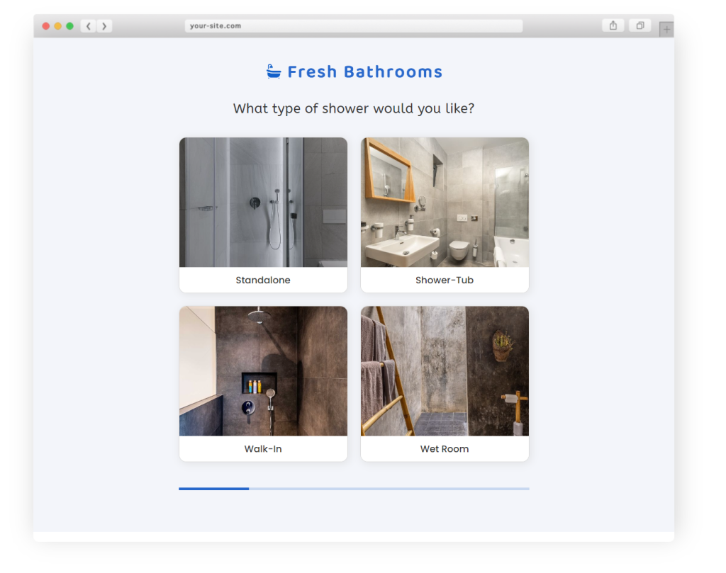
Newer information or experiences are more likely to grab a person’s attention. So, when creating lead generation forms, it’s important to include unique, attention-grabbing elements. This could be in the form of a catchy headline, a bold design, or eye-catching visuals.
12 Design Principles for Optimized Lead Forms
1. Position Your Lead Form Above the Fold
Your lead form should be one of the first things visitors see on the page. That means it needs to be above the fold—no scrolling required.
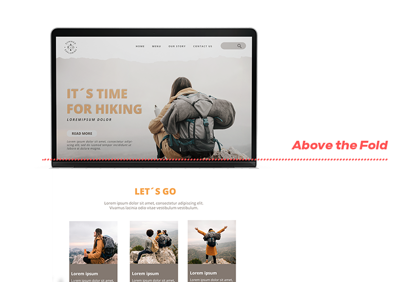
This simple placement decision can increase conversions by up to 94% compared to forms that sit below the fold.
2. Run A/B Tests
Testing different variations of your form can reveal what works best. For example, run an A/B test to determine the most effective CTA button color. Based on the data from these experiments, continually refine your forms to chase higher (and higher) lead conversion rates.
To run A/B tests on your forms, you need a dedicated A/B testing tool (like A/B Tasty) or a form-building tool that supports A/B testing. For example, we’re close to launching this feature for Growform—once it’s live, you can A/B test your forms and field lengths in-app.
3. Order Fields from Easiest to Hardest
The sunk cost fallacy says that people are more likely to stick with something they’ve already invested time and effort into. Translating this to forms, the more time they invest, the harder it is to scare them away with tough questions.
Start with the simplest and most essential fields (like name and email) and move towards more complex ones (like detailed inquiries). This method reduces initial friction and builds momentum, making users more likely to complete the form.
4. Limit the Number of Fields
Only ask for information that you truly need.
More fields can overwhelm users and reduce conversion rates. Aim for a balance between gathering enough information and not scaring users away.
To do this, make a list of must-have and nice-to-have data points. Start by including must-have fields and incrementally add nice-to-have fields as needed. This pairs well with A/B testing, as you can see which fields are hurting conversions.
Pro Tip: Limit form fields by using trackers to gather additional information. With Growform, you can easily track UTM parameters, referral sources, and hidden fields without asking for them directly from users.
5. Use Clear and Concise Labels
Your form field labels should be easy to understand. Avoid jargon and technical terms. Clear labels guide users smoothly through the form while also reducing confusion and errors.
A simple example? Write “First Name” instead of “Given name”. The latter is potentially confusing, while the former is straightforward and universally understood (by English speakers).
6. Add Helper Text
If you need to include a few complicated questions, make sure you explain exactly what you’re asking the respondent to do. Use the helper text below or beside these complicated questions to offer more details and guidance.
For example, say you’re building a mortgage calculator. One of their fields is “ Property Value”. This might be confusing to some people, so add a snippet of text to help clarify—“Enter the estimated sale price or appraised value of your property.”
7. Implement Inline Validation
Provide real-time feedback as users fill out your form fields. For example, if an email address is entered incorrectly, highlight the error immediately. Inline validation helps users correct mistakes on the spot, improving their overall experience.
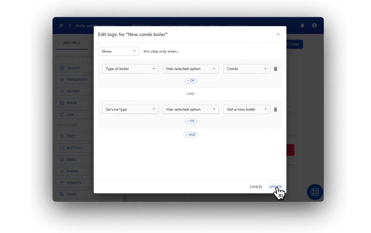
Whether or not you can do this will depend on your form builder. At Growform, we let users create complex validation rules to make sure that they’re getting useful info with every submission.
8. Optimize for Mobile Devices
Mobile-friendly forms can result in up to a 50% increase in completion rates compared to non-optimized forms.
Many users access websites via their smartphones, and a form that isn’t optimized for mobile can lead to lost leads. Use responsive design principles to ensure your form looks good, loads quickly, and functions well on all devices.
9. Use Compelling CTAs
Your call-to-action (CTA) button should stand out and entice users to click. Use action-oriented language like “Get started by ___” or “Fill out this form to ___” to create a sense of urgency and excitement.
10. Use Social Proof and Trust Signals
Another way to address privacy concerns is by showcasing positive testimonials from satisfied customers directly adjacent to the form. They should highlight the benefits and positive outcomes of completing the form.
Displaying trust badges and security certificates near the form can reassure users that your website is credible.
11. Show Progress Indicators
If your form has multiple steps, include a progress indicator. This visual cue helps users know how much longer the form will take to complete, reducing the likelihood of abandonment.
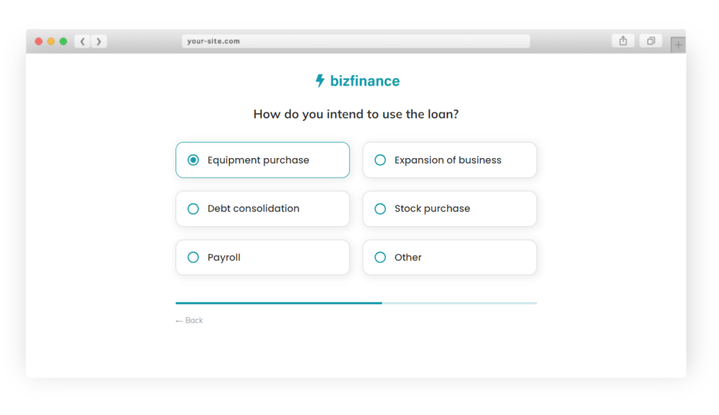
Growform’s custom style and design functionality give you complete control over your form design, including progress bars, fonts, color schemes, and CSS tweaks.
12. Personalize the Form Experience
If possible, personalize the form based on the user’s previous interactions with your site.
For instance, if a user has interacted with particular features or viewed specific pages, tailor the form or the landing page to reflect those interests. Personalization can increase relevance and the likelihood of form completion.
Growform’s advanced conditional logic enables a custom form-filling user experience based on previous responses. We let you collect more relevant and detailed information by showing or hiding fields or entire steps.
Conclusion
Lead form optimization is essential for any business looking to convert more visitors into leads.
Understanding the psychology behind form fields and applying best practices in form design can enhance user experience and improve conversion rates. Remember to position your form above the fold, run A/B tests, order fields from easiest to hardest, and keep forms concise and clear.
Consider using Growform to create highly optimized forms that convert. Get started with a free trial to see what Growform can do.
Recent Posts
- Our Top Picks for Real Estate Lead Generation Companies to Boost Your Business
- How To Send Conversions To Facebook/Meta via Conversion API (CAPI)
- Top 9 Lead Distribution Software to Maximize Sales Efficiency and Conversion
- Our Ultimate 7-Step Lead Qualification Checklist for Sales Success
- We Share Our Top Strategies to Help You Generate More Web Design Leads
