Lead Capture Forms That Convert In 2023: 5 Powerful Tips + Examples
April 2023 update: We’ve added lead capture form examples, refreshed tips and added up to date references.
Your product might be the best thing since Pop-Tarts.
You might have a brand story so compelling it puts Hemingway to shame.
But if you don’t have a reliable mechanism for capturing leads, you’ll struggle to hit your business goals.
No wonder, then, that 79% of marketers surveyed for SEMRush’s 2021 State of Content Marketing report said their top priority for the year was to generate quality leads.
Once you figure out a way to reach your target audience and bring them to your website, it’s about compelling them to convert. Which is where lead capture forms come in.
Table of Contents
What is a lead capture form?
A lead capture form is a tool for gathering a prospect’s data. Marketers use that data to reach out to the prospect via various channels — phone, email, social — in the hope of turning them into a fully fledged paying customer.
Your “classic” lead capture form looks a little like this:
Because we need a little persuasion to fork over our personal data, prospects will be offered something in exchange for completing a lead capture form, such as:
- A product demo
- A piece of content
- A free product trial
- An event invitation
- A discount code
Lead capture forms vs lead pages
To be clear, lead capture forms aren’t the same as lead capture pages.
A lead capture form is a combination of questions, fields, prompts, and maybe a button or two.
(Most) lead capture pages incorporate a lead capture form, but they can also include a bunch of other stuff, from demo videos to customer testimonials to sales copy.
5 tips to create high-performing lead capture forms
So we know it’s in your best interest to create engaging, impactful lead capture forms that your prospects just can’t wait to complete.
But what do those forms look like? And what makes them so effective?
To answer those questions, let’s dig into five of the most impactful best practices for building high-performing forms.
5 – Create custom forms for each campaign
A form is a form is a form, right? Once you’ve built one, you can use it for every campaign under the sun, regardless of whether you’re targeting small business owners or enterprise CEOs.
Actually, no.
Personalization is super important in all facets of marketing, with 90% of leading marketers agreeing that it significantly contributes to business profitability. Lead capture forms are no exception; your forms should be custom-built for every campaign.
So how does a personalized lead capture form look? Check out the first step of this multi-step form for a ride-sharing service, targeting prospective drivers:
Rather than leading with generic information — like name and email address — it asks if we have a car, or if we need one.
In other words, it’s immediately clear that this lead capture form has been tailored to the needs of the specific campaign.
That makes us feel confident that when we complete the form, we’re going to end up with our information languishing unread in an irrelevant inbox for weeks. Rather, it feels like we’re going to achieve our desired goal (in this case, becoming a driver).
4 – Context is everything when choosing form fields
Conventional wisdom holds that the shorter your lead form, the higher your conversion rate will be.
As with a lot of conventional wisdom, there’s logic behind the theory. Your prospects are busy; they don’t want to waste time telling you their work phone number, company size, street address, and zodiac sign when all you really need is their name and email.
But just because something is a common practice, that doesn’t automatically make it a best practice.
Michael Aagaard, former senior conversion optimizer at Unbounce, inadvertently demonstrated that longer is sometimes better.
He stripped a nine-field form back to just six fields, fully expecting his conversion to go through the roof:
But in reality the exact opposite happened — four weeks into the trial, lead volumes had dropped by 14%.
Far from streamlining the user journey and driving completions, Aagaard theorized that he’d actually stripped out the three fields that users most wanted to fill in. Hey presto, when he reversed his original action and tweaked the label copy, conversions climbed by 19%.
The lesson here? Context matters in lead form design.
If I’m looking for a project management tool, it’d probably give me more faith in your product and expertise if you ask me relevant questions — like the size of my team, and the types of projects I manage — rather than just collecting my name and email address.
But remember: this definitely doesn’t mean you should try to gather a bunch of unnecessary information just because you “might need it at some point”. That’s a surefire way to tank your conversion rate.
3 – Use a multi-step form
No user wants to be presented with a lead form that’s so long, it barely fits on a single screen. It’s daunting, and it looks like it’ll take an age to complete.
But, as we’ve already discussed, stripping out key elements from your lead form might not be the way to go. It’ll give you less data to work with, and it might even cause your conversion rate to plummet.
Which is why you should be using multi-step lead capture forms.
Rather than bombarding prospects with a million questions at once, they break the lead capture process into multiple short steps:
Adding a progress bar to your multi-step form is another smart move. It makes prospects feel like they’ve accomplished something by answering a question or two, so they feel compelled to keep up the good work and fill out the rest of your form.
Throw an attractive, must-click button into the mix too and you’ve got a recipe for a high form completion rate.
We’d be remiss not to add here: you can use Growform to create next-level, high converting multi step lead capture forms.
2 – Add labels rather than placeholder text
Using placeholder text in lead capture forms without labels is a real bugbear of ours.
We can see why so many brands do it. You need some way to tell your prospect what information you want them to enter into each field, so you include a prompt in the field itself, like in this example:
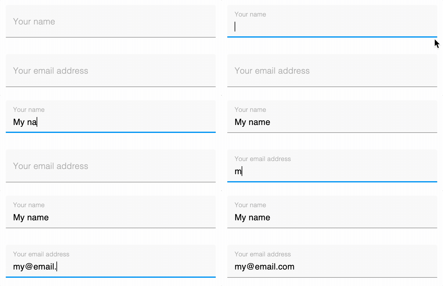
But what happens when people start typing in one of those fields? The placeholder vanishes. So if they get distracted and forget what they were typing, they have to delete their copy — or, even worse, refresh the whole page. Infuriating!
Relying solely on placeholders also means there’s no way for prospects to go back and check they’ve filled everything in correctly. You could enter your information in all the wrong fields and only find out once you hit the Submit button. Then you have to start over.
But it doesn’t have to be like that.
If you’re using placeholders, they should become labels to make sure the user knows which field is which:

Conveniently, this smart label behaviour is another Growform feature!
1 – Ask your simplest question first
Think back to your student days.
Did you ever turn the page on an exam paper to be confronted with the most complicated question you’ve ever seen? All your hopes of acing this test without breaking a sweat disappear faster than you can say: “How do I book a resit?”
It’s the same with lead capture forms. If the first question looks too complex, it doesn’t inspire us to tackle the rest of the form. We promise ourselves we’ll come back to it later when we’ve got more time — but we never do.
This is why you should always start your lead capture forms with the simplest possible question, like this example for a life insurance quote:
Everyone on Earth knows if they’re a smoker or not. It takes two seconds to answer that question and sail onto the next — and once we’ve started a form, it’s in our nature to want to complete it.
Top lead capture form examples
Collecting examples of the best lead capture forms is kind of an obsession of ours.
After all, if we’re going to help our customers build the best forms on the internet, we need to know what we’re competing with!
Here are a couple of our favourites:
“Let’s chat“, – life insurance lead form by Lemonade.com
Conversational lead capture forms can be a high-risk tactic.
Get it right and you disarm your prospect with engaging messaging; get it wrong and you sound super patronizing (don’t talk to me like I’m a child, I’m trying to buy home insurance here!).
Lemonade.com manages to be charming rather than annoying with this conversational lead form…
Again, there’s a lot to like here:
- The conversational tone fits Lemonade’s brand like a glove
- It offers a clear reminder of the benefit to the user — an awesome insurance price
- It leaves the highest-threat questions — like date of birth and email address — until the end of the form
Try this template: Life insurance lead generation form template
Like these lead forms? Want to see more? Check out our article on the 10 best multi-step form examples and why they work.
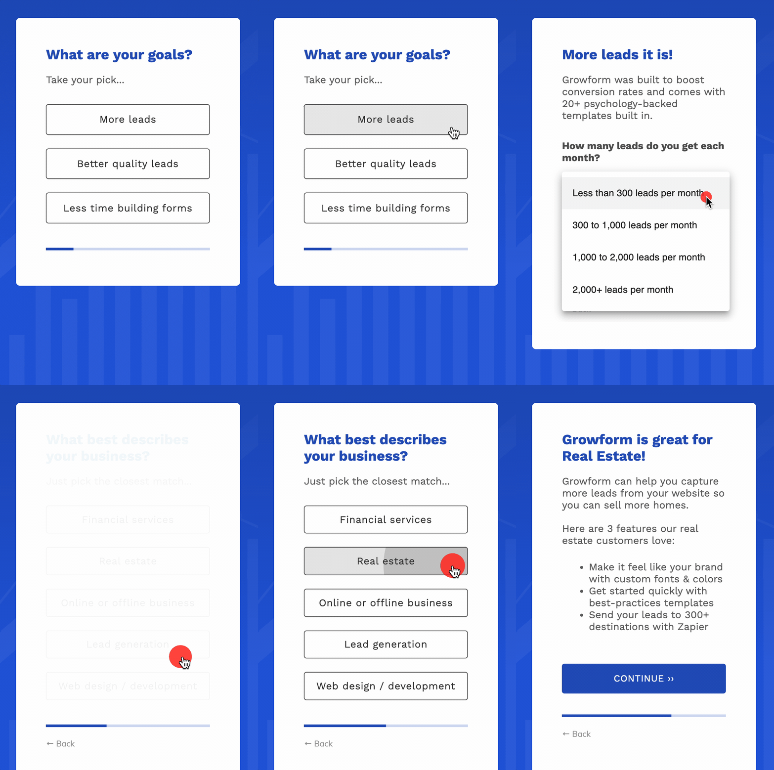
“What are your goals?” – B2B SaaS lead form by Growform
Our very own lead form makes maximum use out of conditional logic, progress bars and simple design to create an irresistible form:

As a B2B SaaS lead form, it asks more personal questions at the end and seamlessly redirects the user to the app, where they’re greeted with a personalised message. Nice!
Beyond its general good looks, there’s a whole lot to like about this multi-step form:
- It starts with a simple, low-friction question
- It provides benefits to the user as they fill out the form
- It seamlessly leads to a friction-free signup process
How do you create a lead capture form like this?
It’s simple enough to build a static lead capture form with minimal technical skill by using a WordPress plugin (or one of the myriad other online form-building tools out there).
But as we’ve demonstrated in this article, static forms are just so… uninspiring.
To create a high-performing lead capture mechanism, you need a multi-step form.
Problem is, those are traditionally tough to build. Factor in all the integrations, maintenance, and validation rules, and you could be facing a custom development bill with more zeros than a line of binary.
Fortunately, there’s another way. Growform’s simple-to-use multi-step form builder allows you to create your own high-converting forms with absolutely no dev support.
And best of all, there’s a 14 day free trial, with no credit card required.
Recent Posts
- 6 Essential Mobile Form Design Best Practices for Higher Conversions
- We Review the Best B2B Lead Generation Tools to Supercharge Your Campaigns
- Typeform Pricing: Uncover Hidden Costs & a Better Alternative
- How to Optimize B2B Lead Scoring for Faster Sales Closures
- Here Are the Best Google Forms Alternatives for More Efficient Data Collection
