Here Are 10 Best Practices for Creating Effective Lead Capture Forms
Helpful summary
- Overview: We introduce essential lead capture form design tips to help you capture more, higher-quality leads.
- Why you can trust us: We’ve helped hundreds of businesses maximize the impact of their conversion-oriented pages with high-performing lead capture forms.
- Why this is important: Our advice is founded on proven techniques and methodologies to increase the likelihood of higher conversion rates.
- Action points: Start with a solid foundation of data so you know who you’re asking, what you’re asking them, when the best time for the form is, and where it’ll be most effective.
- Further research: Check out the Growform blog for the best lead-capturing advice to support your lead-generation strategies.
Want to Learn About Lead Capture Forms?
Capturing leads is critical for any business. Whether you’re a lead generation company, a solar panel installer, or a growth marketing consultant, your lead capture forms can make or break your lead generation efforts.
It can also be tricky to get the design of your lead capture forms right. That’s why Growform has to put together ten essential UX-backed tips for creating high-quality lead capture forms.
But first…
Why Trust Us?
Quite simply, we know what works. Our strategies and practices are reliable and effective, which is why our platform and industry-leading advice are trusted by businesses operating in a wide range of industries.

Check out our testimonials page to see the results we’ve helped businesses like BeMarketable and Stax Payments achieve.
What Is a Lead Capture Form?
A lead capture form is designed to gather visitor contact details on your website. How? By offering an irresistible incentive like a must-read e-book, exclusive webinar, or a tempting discount.
Lead capture forms are strategically nestled within landing pages, pop-ups, or your website’s content. The best designs will hook potential customers and collect their information. The ultimate goal is to transform leads who are interested in your products into paying customers.
It all starts by building an email list generated by these forms. You’ll need to ensure your forms are easy to complete, engaging, and effective by using clear headlines, minimal fields, and compelling calls to action.
Explore a variety of lead capture form examples to help you design the perfect form for your business and boost conversions.
10 Tips for Creating High-Converting Lead Capture Forms
1. Analyze Your Audience
A great lead capture form is designed specifically around the leads it’s trying to “capture.” In other words, it needs to show up for the right people, in the right place, at the right time. That’s three separate questions that you need to ask yourself before you even start creating the form:
- Who?
- When?
- Where?
The first question is easy enough to answer if you’re targeting a clear ideal customer profile. But what about the other two?
“When” is all about timing—when is the person you’re targeting with the form most receptive to filling it out? Look into your website and conversion data to understand the length of the buying process and map out funnel stages. Lead forms are typically most effective at MOFU stages.
“Where” is all about location—where on your website or other online channels is your target audience most likely to see and interact with the form during the MOFU stages? Segment your audience into funnel stages and see which kinds of MOFU content are most popular.
The overall message here? Start with a solid foundation of data.
2. Choose the Right Form Placement
The position of a form is (in many ways) more important than the form itself. It determines which kind of visitor sees it, what percentage of visitors fill it out, how they found it, and how likely they are to eventually convert.
So, think long and hard about the best position for your form. To help you out, here are some common positioning strategies (and their pros and cons):
- Hero Section: This is one of the most common positions for a lead capture form. It ensures that everyone who opens the page will see the form. However, this “in-your-faceness” sometimes prevents people from engaging with on-page content.

- Within Content: If your page has a lot of on-page content (+350 words) you should probably embed lead capture forms throughout (roughly once per 350 words). This highlights your content while reinforcing the added value on offer.

- Popup: Tailored pop-ups are activated by user actions like scroll depth, time on the page, or exit intent (with a more advanced tool). This can be a great way to strongly encourage lead opt-ins, but you do risk annoying popup haters.
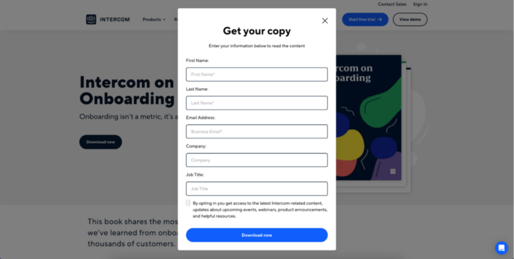
- Bottom of Content: This is usually a placement you’d use in addition to another from this list. However, it can be used on its own. The benefit? Only visitors who really engaged with the on-page content will make it to the form, which dramatically increases the quality of the leads.
There’s no definitive, one-size-fits-all answer to where the best form placement is. It’s influenced by factors such as:
- Offer nature
- Audience
- Page layout and content
- Your marketing objectives
Find the best placement for your case with some trial and error. Use A/B testing (more on that later) to test different form spots and evaluate the outcomes. This will help fine-tune your strategy, which is grounded on real user engagement and conversion stats.
3. Keep it Concise (and Use Multistep Forms)
Evidence about length and form completion rates is a bit conflicted. However, most experts tend to agree (unsurprisingly) that forms should be as short as possible. Filling them in takes effort, and expending effort is something people tend to avoid.
For a lead capture form, the singular objective is getting the lead’s contact information, so really, the only “must-ask” fields are name, email, and phone (optional). However, if you want to target the lead with more personalized content or offers, you might consider adding a few optional questions.
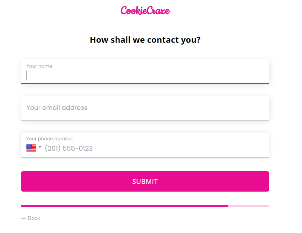
When it comes to form length, aim for 3-5 fields. To boost completion rates even more, create a multistep form with a builder like Growform to make it feel less daunting (the next step is only revealed when the current step is completed).
This pairs very nicely with progress indicators, as it gives users a sense of accomplishment and motivates them to continue filling out the form. Additionally, consider using autofill fields for commonly asked questions (e.g. city, state, company name) to further streamline user experience (UX).
4. Write a Compelling Headline
Craft a potent and unambiguous headline. An advantage-focused title that clarifies the rewards users gain from completing the form will help visitors power through initial friction points and build upthe momentum required to get a completed form.
For example, if you’re in the lead generation industry, a good heading would be “Double Your Leads in 30 Days – Schedule Your Free Strategy Session.” A solar panel installation company could say something like, “Transform your home with solar power – Request your free assessment!”
These headlines work well as they convey the value proposition crisply, spark a need for quick action, and directly tap into the potential customer’s curiosity about the solutions.
5. Write a “Powerful” CTA
What makes a CTA truly powerful? Here’s a hint, it’s not generic, boring, played-out phrases like “Submit” or “Click Here.” Instead, great CTAs incorporate power words and personalization to maximize their impact and encourage clicks.
Examples of powerful CTAs include:
- “Get access to insider lead gen tips”
- “Join the top 1% of sales reps”
- “Unlock exclusive content”
6. Highlight the Value
Lead capture forms are a value exchange. Visitors take the time to fill them in and offer up their contact information for free, and you offer them something in return. That “something” (also known as a lead magnet) is a very important part of this equation.
It needs to be something good enough that it inspires action. But it obviously can’t be so good that it means visitors no longer need you. This is a tricky balance to strike, which is why many businesses choose highly focused content like:
- Reports
- Free tools
- Ebooks
All of these mediums are able to solve smaller problems very effectively. In the process, they inspire trust and communicate your ability to solve larger problems. All of this needs to be made clear in the content you create and offer as a lead magnet.
7. Use Single-Column Layouts
Boost your conversion rates and minimize form abandonments with single-column lead capture layouts.
They offer a clean, straightforward path that lessens cognitive workload and sidetracks, enhancing user experience. Single-column forms are more straightforward to scan and fill out quickly. Use a visually appealing layout with adequate white space and clear labels for each field.
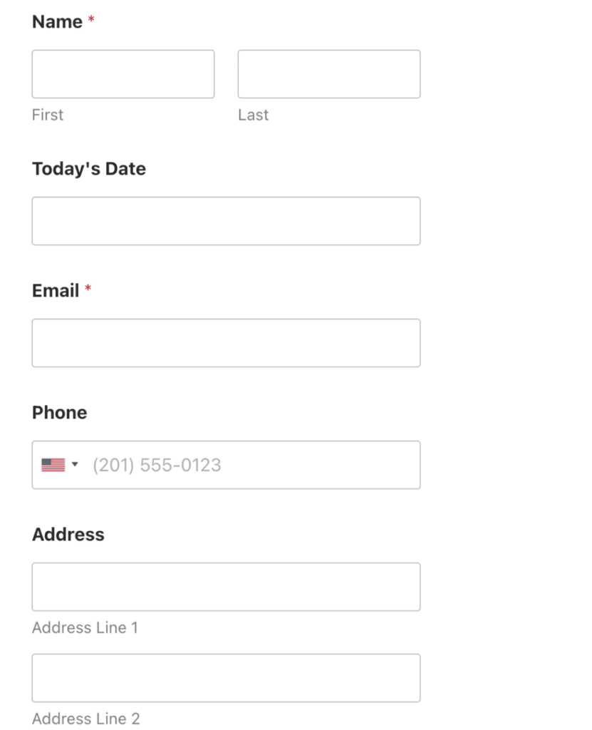
Don’t want to worry about manual formatting? Most form builders offer pre-made templates.
For example, at Growform, we offer 100+ templates catering to all kinds of use cases and industries. Start with one that you like, and use a wide range of no- and low-code customization tools to really make it your own…
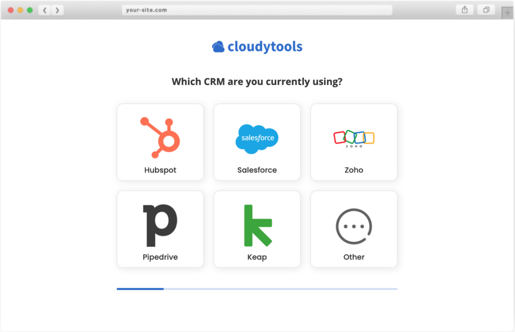
…or you can just embed it as is!
8. Design for Mobile Users
As you’re probably aware, more than 50% of searches originate on mobile. That means there’s a good chance your lead form will be accessed by as many mobile users as desktop users. So, you need to make sure it looks and functions great on smaller screen sizes.
When designing your form, consider the following:
- Tap-friendly buttons: Ensure the buttons have enough space between them to prevent accidental taps and users with giant fingers.
- Minimize typing: Use dropdowns, checkboxes, and auto-complete fields to reduce the need for typing.
- Clear instructions: Provide concise instructions and tooltips to guide users through tricky questions.
- Error handling: Include in-line validation and clear error messages to help users correct mistakes quickly.
Luckily, tools like Growform take care of this for you—here’s an example of one of our forms adapting to mobile.
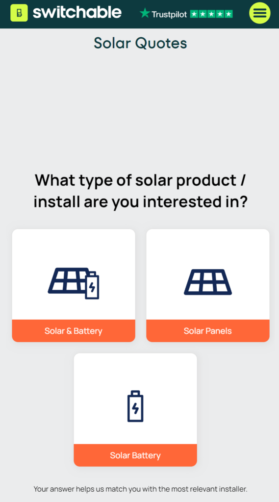
This means all you need to do is create a form that looks great on a desktop. We’ll make sure your design translates well to mobile, too.
9. Incorporate Trust Signals
“Trust signals” are on-page elements that foster a sense of trust in your business and the lead capture form. Think—security badges, ratings, and testimonials that assure users that their data will be handled responsibly.
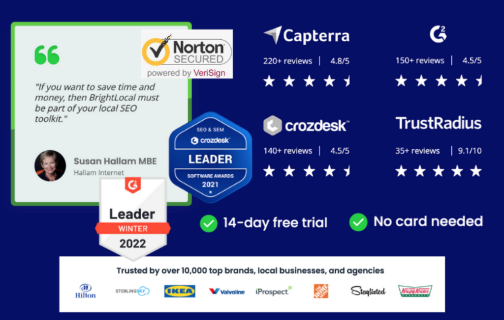
Some great options to include are:
- SSL certificates
- Accreditations (e.g., Better Business Bureau)
- Customer reviews and ratings
- Money-back guarantees
- Privacy policies
- Certifications (e.g., ISO)
For maximum effect, include these directly below the lead capture form.
10. Test and Iterate
And finally, the game-changer is to keep testing and iterating your form’s design.
This helps you spot and fix usability glitches for a smoother, optimized journey and spike in completion rates. By continuously testing, you can make data-backed tweaks that make your form a delight to use. You’ll efficiently snag leads by hitting right at their pain points and tailoring your form to match user behavior.
A/B testing and user testing are the most effective types of testing when it comes to refining your design. A/B testing allows you to experiment by directly comparing different versions of your form to find which elements improve or hinder completion rates.
User testing lets you observe users interacting with your forms, allowing you to get immediate feedback on areas of confusion that may not be clear through A/B testing. It is particularly useful for complex forms in industries like insurance, real estate, finance, and leading services.
So what are the pros and cons of both?
- A/B Testing. In a nutshell, A/B testing is scalable and allows you to hone in on specific design elements. However, it requires significant user traffic to get statistically significant results and can take a while to run properly if traffic is low.
- User Testing. Seeing user behavior is great for adding context to A/B testing. However, setting up sessions can be resource-intensive and involve smaller sample sizes.
Verdict?
Both methods can be complementary, so test iteratively using both if and when you can.
Conclusion
Lead capture forms are a powerful way to gather contact information from leads at scale. But they aren’t effective by default—you need to understand the best practices and use them correctly. Hopefully, this guide gave you some guidance and food for thought.
Ready to start implementing? With Growform, you can have a beautiful, functional lead capture form up and running in minutes. Our range of templates and no-code builder makes it easy for anyone to reap the rewards of effective lead forms.
Get started with a 14-day free trial today.
Recent Posts
- Anatomy of a Landing Page: 12 Essential Elements for Higher Conversions
- 8 Best Webinar Landing Page Examples to Boost Signups
- 10 Best ClickFunnels Landing Page Examples That Actually Convert
- How to Improve Landing Page Optimization and Boost Conversions
- Landing Page Metrics That Matter: 12 KPIs to Boost Conversions
