How Multi Step Forms Can Increase Your Conversion Rate By 100%
This article was updated in April 2023 to reflect new multi step form best practices.
If you’re anything like me, you’re always on the lookout for conversion rate optimisation (CRO) tricks.
And if you’ve spent anywhere near as much money on ads as me ($2,000,000+), you’ve probably tried every CRO trick under the sun.
But have you tried using multi step forms to harness the sunk cost fallacy?
The idea is based on decades-old, proven psychology – and once you understand it, you’ll start to see it everywhere.
It’s an extremely potent, yet under-used weapon that should be ready and present in your marketing arsenal.
And I’m going to show you exactly how to use multi step forms on your landing page forms to huge effect.
Table of Contents
First, What Is “The Sunk Cost Fallacy”?
The sunk cost fallacy is a well-established psychological principle first coined in a journal called “Organizational Behavior and Human Decision Processes”, back in 1985 (Arkes & Blumer).
The authors state:
Individuals commit the sunk cost fallacy when they continue a behavior or endeavor as a result of previously invested resources – such as time, money or effort.
In other words, the mere act of starting a process makes a person more likely to finish it.
Let’s unpack that with some examples:
- Have you ever found yourself 30 minutes into a boring movie, but continued to watch it anyway, since you’ve already spent half an hour on it?
- Or have you felt the urge to buy something at the mall, just because you spent time and effort getting there in the first place?
- Perhaps you remember gambling, spending most of your budget, and thinking that you may as finish it now most of the cash is gone?
These are great examples of the sunk cost fallacy in action.
And it doesn’t just affect individuals – in fact, the continued investment into the failed Concorde is famously attributed to the sunk cost fallacy. It’s even been referred to as “The Concorde fallacy“!
The sunk cost fallacy is basically a fancy way of describing the feeling:
“I’ve spent a certain amount of time/money/effort on this, so I may as well finish it”.
How Multi Step Forms Use The Sunk Cost Fallacy
In the marketing world, CRO experts and leading agencies are using the sunk cost fallacy to great effect in the area of multi step forms.
What’s your first thought when you see a form like this?
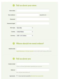
“NOPE!”.
But if you could only see a single question at first, you might be more open to start filling it in:
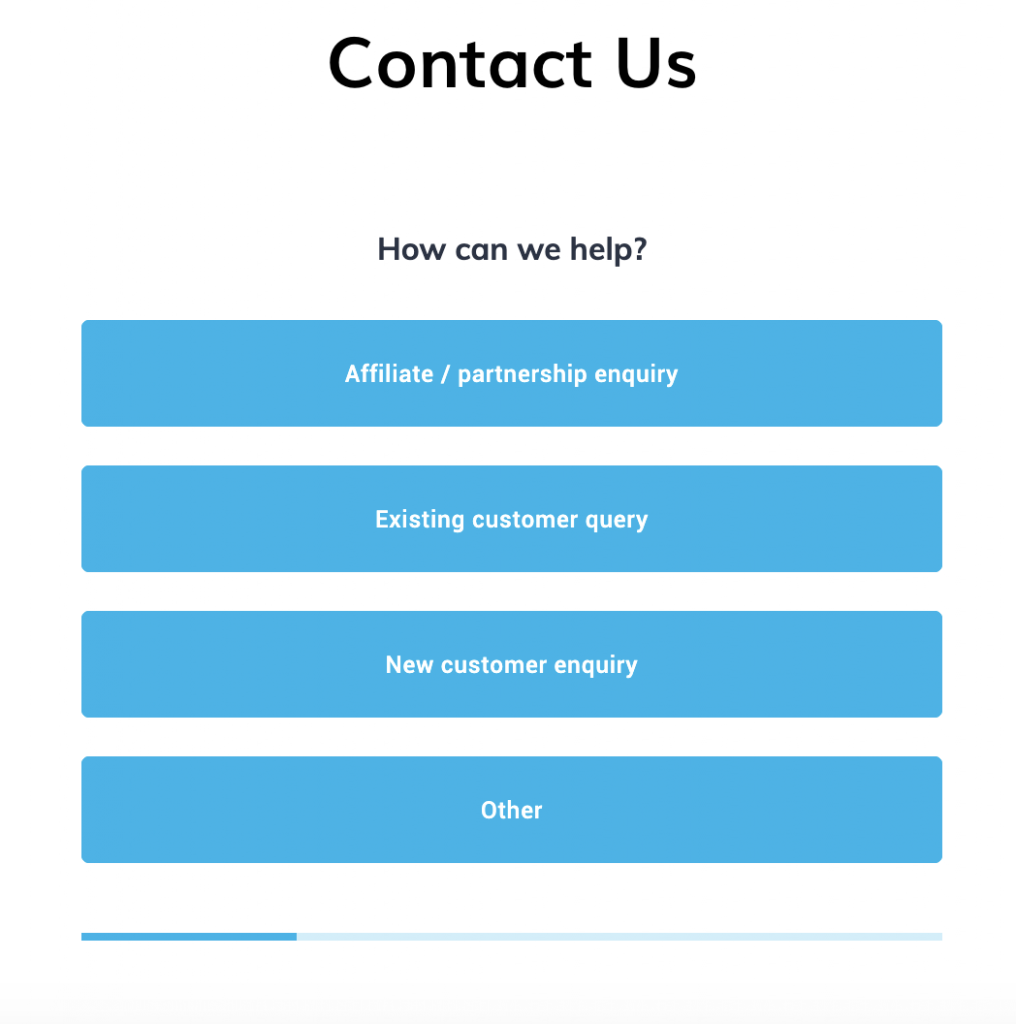
And since you’ve started, you may as well finish, right? After all, the progress bar indicates you’re halfway through now!
This is why multi step forms are so ridiculously effective: they give your visitors a sense of momentum and progress, rather than letting them hit a wall.
Case Studies + Proof Of Multi Step Forms In Action
Klientboost worked with a financial institution who were using a “traditional” (read: long) form. The client had combined all of the contact information needed to get a quote.
The agency got to work and created this beautiful multi step form:
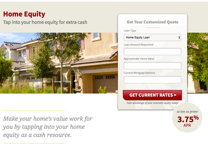
… and here’s what happened:
- CPA was slashed from $800 to $35
- Conversion volume rocketed from 6 per month to 135 per month
- Conversion rate went from 1% to almost 20% –

And a completely different niche, they saw a 214% increase in conversion rate by splitting this form into 2 steps:
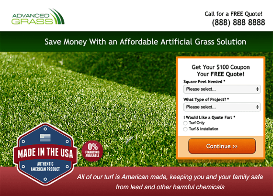
We’ve seen it time and time again.
Nearly Real Florals – a London based artificial florist – originally had a form that looked like this:
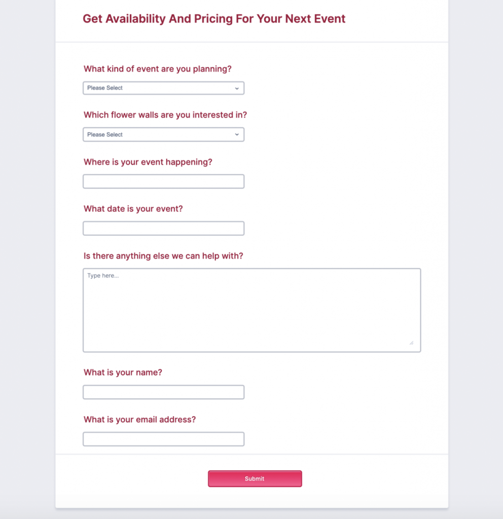
… and used Growform to build a shiny multi-step form that looks like this:

The result?
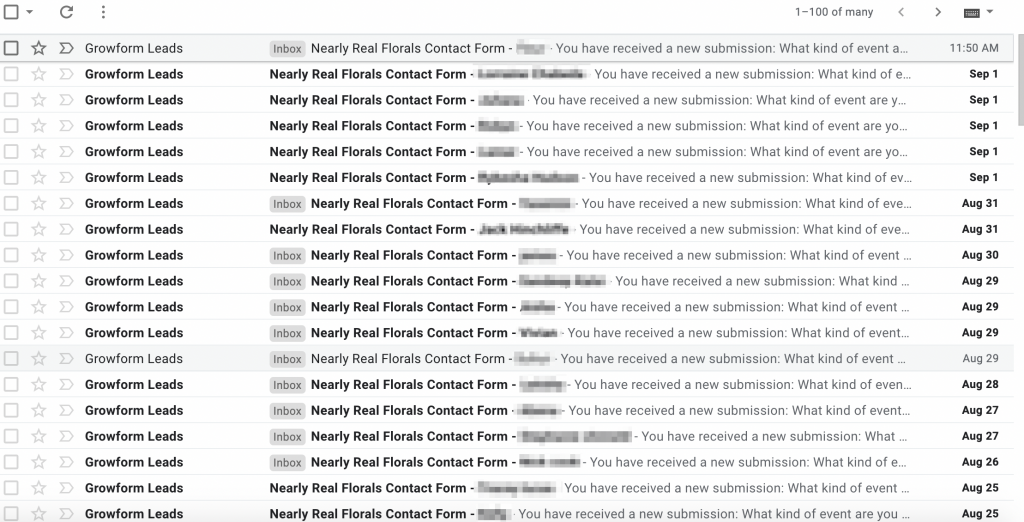
An 87% increase in conversion rate, nearly doubling their overall lead volume:
As we’ve seen from these examples, the power of multi step forms can literally be business-changing.
The Perfect Questions To Ask That Boost Form Conversion Rates
When you build a multi step form, you can’t just throw questions at the wall and see what sticks.
You need to ask the right questions in the right order to create a high-converting form.
You should always start your form on a question that is:
- Low friction and low commitment
- Non-personal, non-controversial and non-intimidating
- Positive or evocative of a “yes” response
Ideally, you should be able to provide clear justification for asking the question and tie it back to a benefit the user will gain in exchange for providing the information.
This follows the principle of “quid pro quo”, and is why you often see headlines like “Get your free quote” or “Download your PDF guide” on landing pages and forms.
Here are some example of great first-questions to ask:
- If you’re selling life insurance, ask how much cover the user wants so you can provide an estimate.
- If you’re selling real estate services, ask the ZIP code of the user’s property is so you can value it.
- If you’re an event planner, ask what kind of event the user is having
- If you’re a personal trainer, ask what the user wishes to achieve from their sessions.
As the form progresses, you can ask for more information using single button clicks, which will have almost no impact on your conversion rate.
Then, at the end of the form, you can ask those higher perceived-risk questions involving more personal data like email addresses or contact information.
There are over 20 examples of this in our template library.
So What Next… How Do I Actually Create A High Converting Multi Step Form?
Multi step forms have traditionally been a sore subject for marketers, as they usually need hundreds of lines of hacky JavaScript or cobbled together HTML.
Some savvy marketers spend $000’s on developers to build multi-step forms, but not everybody has that budget or know-how.
This is why I created Growform.
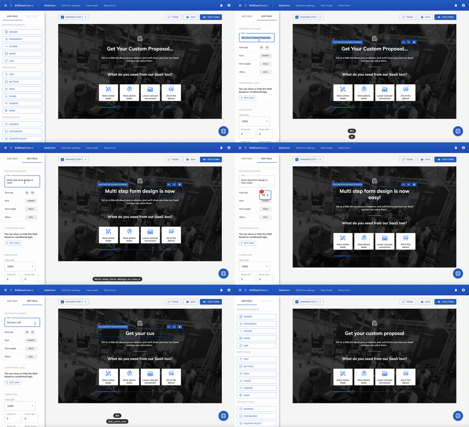
Growform lets you create high performing multi step forms in seconds. It comes with 20+ high converting templates for different industries, and you can use it even if you don’t know how to code:
It has a 5/5 score on Capterra and is available on a 14 day free trial with no credit card required.
So now you know how, why not create your first multi step form and start getting more leads for the same ad spend?
Recent Posts
- 6 Essential Mobile Form Design Best Practices for Higher Conversions
- We Review the Best B2B Lead Generation Tools to Supercharge Your Campaigns
- Typeform Pricing: Uncover Hidden Costs & a Better Alternative
- How to Optimize B2B Lead Scoring for Faster Sales Closures
- Here Are the Best Google Forms Alternatives for More Efficient Data Collection

Comments (22)
Ollie
Aug 24, 2021Damnnnn THIS is why those real estate ads always ask for a zipcode first – super low commitment!! Trying this.
Julian mottram
Aug 24, 2021Thanks for sharing. Extra points for the real life examples, love it!
agency dude
Aug 24, 2021Love this… I’ve posted about multi step forms before. What did you guys use to make the florist one? Looks swisshhh
Harvey Carpenter
Aug 24, 2021Hi @agency dude, this is built with Growform.
hellooo
Aug 24, 2021been trying to add a comment, but keep seeing the message saying I’m a robot?
Harvey Carpenter
Aug 24, 2021I think sometimes users are getting this message, but in fact their comment was received safely sitting in our moderation queue. Either way, I approved your other comment 🙂
Elliot agency
Aug 25, 2021I run a local agency, basiclaly creating unbounce pages have been surviving on using JavaScript to show/hide fields. Pain in the ass to maintain but works. What are the advantages of using a form builder like this?
Harvey Carpenter
Aug 26, 2021Hi Elliot, in a nutshell –
* Much faster to build forms and MUCH easier to maintain
* Start from 20+ templates with years of CRO experience baked in
* Tonnes of different field types (calendar picker, google location, date of birth, etc)
* Send leads pretty much anywhere with Zapier
* Beautiful progress bars + animations. No clunky, slow loading times here.
* Instantly hook up to Google Analytics, Google Ads, Facebook ads, GTM…
* New features being added all the time – conditional logic in the next 3-6 weeks!
anonymous pedant
Aug 25, 2021Did a bit of googling and think the sunk cost fallacy was before then. First reference I found to it was in 1985 (Arkes & Blumer). Might want to update your article 🙂
Harvey Carpenter
Aug 26, 2021Thanks for your comment! Right you are – good thing we’re CRO people and not history people!
Have updated. Have a nice day 🙂
Sammy
Aug 25, 2021good to see the word getting out, we love our growform subscription. Using it for real estate leads.
We basically use the “What is your zip code” q upfront, and fire retargeting pixels on each steps. Works a treat.
mary design
Aug 25, 2021Am 1 day into the free trial and already set my first form up, very nice experience so far
1 q – we use future on our website… can I use custom fonts to make it blend in a bit more?
Harvey Carpenter
Aug 26, 2021Hi Mary, glad to hear you’re enjoying it!
Yes, you can use custom fonts – see: https://www.growform.co/es/how-to-use-custom-fonts-with-growform/
Jack
Aug 25, 2021I remember the fiasco around funding of the concorde project back in the 90s. Everybody kept throwing money at the problem despite no results. Damn impressive aeroplane though, that thing was fast and the booms were so loud. Thanks for bringing back good memories.
Hipsta
Aug 25, 2021thought this was going to be another orange vs green button CRO article, then I saw the meme. well played hahaha.
Angela Liams
Aug 26, 2021Hi there, the growform forms look really nice – can we use them w Unbounce?
Harvey Carpenter
Aug 26, 2021Hi Angela, yes absolutely, we love unbounce – https://www.growform.co/how-to-use-growform-with-unbounce/
Dave media
Aug 26, 2021so I’ve tried multi step forms in the past and got pretty decent results (leads went up from 40-50 leads a month to 80-90).
but I’m thinking the lead quality isn’t always as good, as some leads don’t reply. Is this normal?
Harvey Carpenter
Aug 26, 2021Hi Dave,
I’d think of the incremental leads you get from ANY optimisation efforts to be on a spectrum in terms of motivation.
Let’s say – for argument’s sake – your website takes a whopping 10 seconds to load.
Only the most motivated users are going to wait the entire 10 seconds – most users will drop off.
By optimising your site to load in 2-3 seconds, you might find you get 10x as many signups as that first visitor. But of course, they may not all be quite as motivated as the person who waited a whole 10 seconds for the page to load.
So does that mean we should just keep our website loading slow? Of course not!
Every lead is valuable, no matter where it sits on the motivation spectrum. Some leads will be 90% as motivated as the most motivated leads, others less so.
With proper lead nurturing and retargeting you’ll find the extra leads to be extremely valuable.
People often ask me about “good friction” in forms. There’s no such thing – collect as many leads as you can, then nurture and qualify them later – that’s what good marketing is all about!
Dave
Aug 28, 2021Awesome, that makes sense.
Going to give Growform a go now (and do some lead nurturing this time)
Charlie says
Aug 26, 2021Those case studies are sick. Have seen klientboost around before, they look good.
Alan P
Sep 01, 2021We’ve been running multi-step for the last couple years for almost all of our agency clients.
It’s one of the first items on our in-house checklist, along with clear CTAs and fast page speed