Below the Fold
« Back to Glossary IndexQuick Summary
Below the fold refers to the part of a webpage users see after scrolling. While it gets less immediate visibility, it’s a valuable space for building trust, telling your story, and placing forms when the timing’s right. With Growform, you can create forms that fit perfectly, above the fold or below. Visit the Growform blog for more tips on form design and conversions.
Is Below the Fold Still Relevant?
You’ve probably heard the phrase “keep it above the fold,” but what about what’s below it?
“Below the fold” refers to the part of a webpage users have to scroll to see. It might sound like a less important area, but how you use it can have a big impact on engagement and conversions.
In this Growform article, we’ll explain what “below the fold” really means, why it matters in web design, and how to use it strategically, especially when building forms and landing pages.
Why Listen to Us?
At Growform, we help businesses build high-performing forms that work wherever they’re placed. With features like conditional logic, validation, custom styling, and seamless embeds, our drag-and-drop builder has all the features you need to build multi-step forms that keep users engaged and drive conversion on mobile and web, whether it’s above the fold or further down.
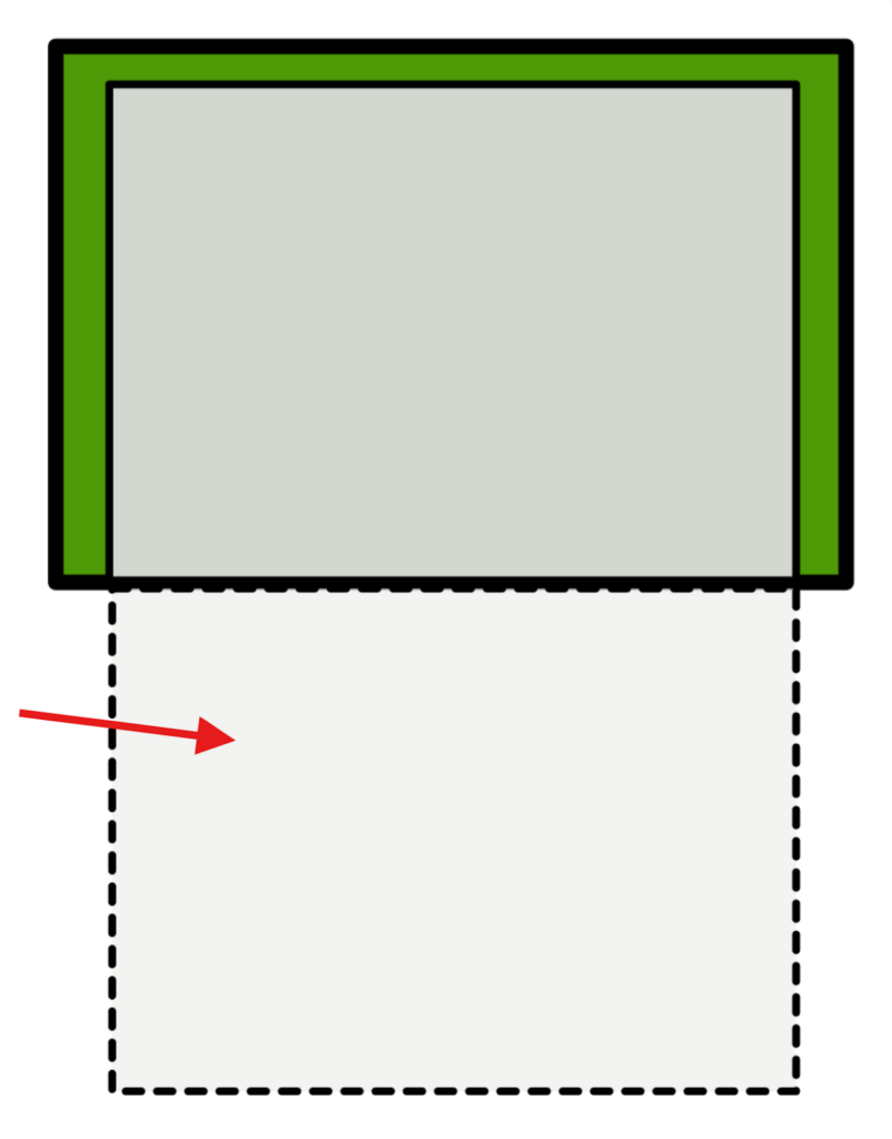
What is Below the Fold?
The term Below the Fold refers to the part of a webpage a user must scroll to see. It comes from the world of newspaper publishing, where papers were physically folded in half.
Content on the top half, Above the Fold, was visible on newsstands and considered prime real estate, while anything Below the Fold was less visible and often used for less urgent stories.
In digital terms, the concept lives on. Today, Below the Fold refers to the part of a webpage that users can’t see right away, they have to scroll to reach it. This includes typically anything:
- Positioned more than ~600 pixels from the top of the page
- Not visible without scrolling
- Placed below the edge of the screen on the first load
Why Is Below the Fold Important?
It may not be visible right away, but the space below the fold plays a key role in how users experience your page. Here’s why it matters:
- Captures Engaged Visitors: Users who scroll are already showing interest. They’re more likely to keep reading and take action.
- Supports Conversion Opportunities: Some visitors need more context before they’re ready to convert. Below-the-fold space lets you build trust before the CTA.
- Expands Your Story: Use it to go deeper, whether it’s explaining benefits, showing proof, or answering key questions.
- Matches Real Browsing Habits: On mobile and desktop, scrolling is natural. Users expect to find more as they move down the page.
Below the Fold vs. Above the Fold
Above the fold is the direct opposite of below the fold. While below the fold requires scrolling, above the fold refers to content users see immediately when a page loads. It’s where you typically find things like headlines, key calls-to-action (CTAs), hero images, or lead forms.
Both areas matter, but they serve different purposes. Check out our post on “Above the Fold” to learn more.
What Can You Place Below the Fold?
With thoughtful design and engaging content, Below the Fold can play a key role in how users interact with your page. It’s an excellent spot for your:
- Testimonials or social proof
- Explainer videos or product walkthroughs
- Frequently asked questions (FAQs)
- Feature breakdowns or benefit lists
- Case studies or use cases
- Trust signals (certifications, guarantees, etc.)
- Pricing details or comparisons
- Secondary calls to action (like “Learn More” or “Book a Demo”)
Best Practices for Designing Below the Fold
1. Match Form Placement to User Intent
Not every visitor is ready to take action right away. That’s why it’s important to think about how complex your offer is, and what kind of journey your audience needs before they’re willing to fill out a form.
- Simple offers (like a free download or discount code) often work well above the fold, no need for extra context.
- Higher-commitment offers (like demos, quotes, or consultations) may perform better when the form comes after a few scrolls, once you’ve built trust.
Ask yourself: does the user need to understand more before converting? If yes, let the form come after the value has been clearly explained.
2. Use Visual Cues to Encourage Scrolling
Just because something’s below the fold doesn’t mean users will naturally scroll to find it. You need to give them a reason. Here are a few simple ways to guide them down the page:
- Add subtle scroll cues like downward arrows or animations
- Let content peek slightly from below the fold to signal there’s more to see
- Avoid “false bottoms,” visual dead ends that make users think there’s nothing left
These cues help draw users deeper into your page, where your form or key content might be waiting.
3. Keep the Content Flow Smooth and Structured
Users are more likely to scroll when the content feels natural and easy to follow. Think of your page like a conversation, you want to guide visitors step by step toward your form, not overwhelm them all at once.
Here’s how to keep it flowing:
- Break content into sections with clear headings and enough breathing room
- Use visuals or subheadings to separate ideas and avoid long walls of text
- Lead with value, and make sure each section builds on the last
A well-structured page helps users stay engaged, and makes it more likely they’ll reach and complete your form.
4. Make Forms Feel Easy to Complete
Once users reach your form, the last thing you want is for them to feel overwhelmed. Whether it’s above or below the fold, a form should feel quick, simple, and worth their time.
Here’s how to keep it user-friendly:
- Ask only what’s necessary, cut out any fields you don’t truly need
- Use multi step forms to break longer forms into bite-sized steps
- Add smart logic so users only see questions that apply to them
If you’re building your form with Growforms, all of these come in-built. Our drag-and-drop builder includes all the features you need to create clean, on-brand multi-step forms with conditional logic and only show what matters.
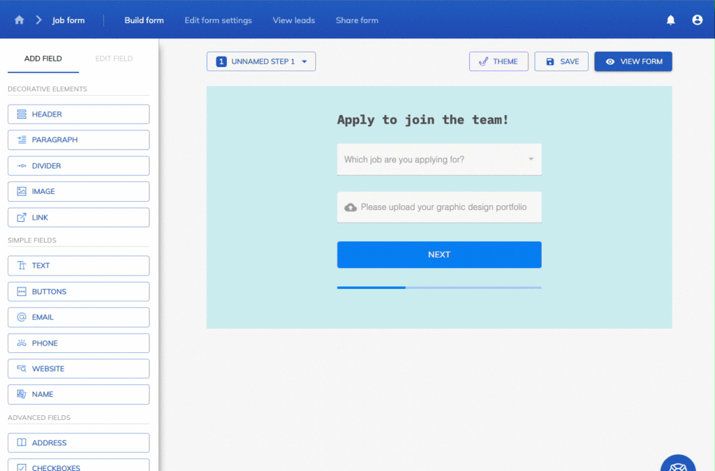
Using the embed code feature, you can easily place the form Below the Fold to keep the experience smooth from start to finish.
5. Test Form Placement and Performance
No two audiences behave the same. So, what works above the fold on one page might perform better below it elsewhere. That’s why testing matters.
Try A/B testing different placements, and use heatmaps or scroll data to see how far users go. If most users reach your form but don’t convert, the issue might be form length or clarity, not just location.
6. Prioritize Mobile Experience
On mobile, almost everything is below the fold, so how you structure your content matters even more. Make sure your form is mobile-friendly, loads quickly, and doesn’t overwhelm a small screen.
With Growform, your forms are fully responsive and easy to complete on any device, giving mobile users the same frictionless experience as desktop visitors.
Maximize your Below the Fold Space with Growform
Below the fold isn’t wasted space, it’s an opportunity. Whether you’re telling a deeper story, building trust, or placing a form where it makes the most sense, how you use this space can impact engagement and conversions.
Growform helps you make the most of it with flexible, high-converting forms that work. Our form builder has all you need to build forms that convert, no matter where they live on your page. Start today with a free 14-day trial!