Conversational Forms Guide: Create Engaging Forms Easily
You’ll fill in a whopping 521 forms throughout your life, and yet, can you recall the last one you completed? Chances are, you can’t.
Let’s face it – traditional forms are dull. Their sole purpose is to extract information from us, often in a monotonous, mind-numbing way.
But with conversational forms, you can start a conversation with your user.
These interactive forms transform the way we provide information, making the experience feel like a natural, engaging chat with a friend.
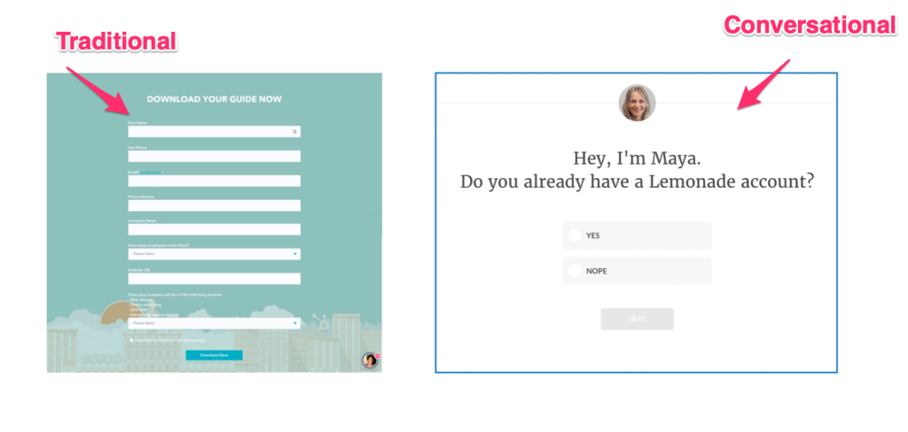
Table of Contents
What is a Conversational Form?
So, what is a conversational form?
A conversational form is an interactive design pattern used in websites and apps to collect information from users in a more engaging and conversational manner.
Instead of presenting an entire form with multiple fields to be filled out at once, conversational forms guide users through a series of questions or prompts, mimicking a natural conversation.
Conversational forms aren’t appropriate in all use-cases (signup forms, for example) – but can often add a little extra personality to an otherwise boring process – and can improve form completion rates significantly.
In this definitive article, we’ll dive into what makes a good conversational form, when you should use and avoid them, and how to get started building your own!
Key Features of Conversational Forms
When designing and building conversational forms, there are several key features to consider.
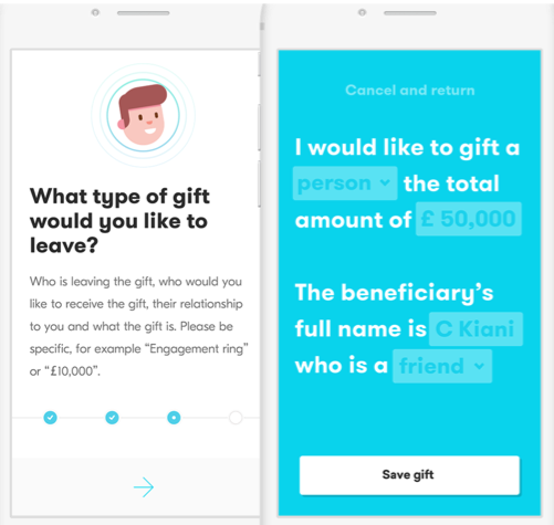
- Natural conversation flow: To create a more engaging and intuitive user experience, conversational forms should mimic the dynamics of a natural human conversation. This involves using a friendly tone, asking relevant questions, and allows users to provide information in a comfortable and familiar manner. By simulating a conversation, users are more likely to feel at ease and respond positively to the form’s prompts – reducing form abandonment.
- Context-awareness: Conversational forms should be capable of understanding the context in which they are being used. This includes recognizing user inputs, remembering previous interactions, and adapting the conversation accordingly. Context-awareness allows conversational forms to provide personalized experiences, tailor their responses, and even anticipate user needs.
- Progressive disclosure: Instead of overwhelming users with a long list of fields, conversational forms should use progressive disclosure to reveal information and options gradually, as needed. This approach keeps users engaged, reduces cognitive load, and makes the process of providing information more manageable.
- Adaptive design: Conversational forms should be designed to adapt to various devices, screen sizes, and input methods. This ensures that users can easily interact with the form, regardless of the device they are using.
Benefits of Using Conversational Forms
There are several benefits to using conversational forms, both for businesses and their users. Some of the most notable benefits include improved user experience, increased conversion rates, and better data quality.
- Improved user experience: Conversational forms provide users with an interactive form – an engaging experience that feels more like a natural conversation than a traditional web form. This makes the process of providing information more enjoyable, reducing friction and increasing user satisfaction.
- Increased conversion rates: By making the process of providing information more enjoyable and less tedious, conversational forms encourage users to complete the form and submit their information. This leads to higher conversion rates, which are crucial for businesses looking to generate leads, grow their audience, or drive sales.
- Better data quality: Conversational forms help ensure that users provide accurate, complete information. By engaging users in a dialogue, these forms can ask clarifying questions, validate user inputs, and even guide users through the process of providing their information. This results in higher-quality data, which can be used to make informed decisions and improve outcomes.
Best Conversational Form Examples for Your Inspiration
Looking for some inspiration? Here are a few examples of conversational forms from across the Internet that showcase
Lemonade.com’s onboarding
It’s refreshing to see a conversational form when applying for insurance – Lemonade.com put a fresh spin on an otherwise dull process.
The form uses a photograph of “Maya” to make this form feel like a chat-like experience, but notice that this isn’t a chat bot – it’s very much a form with conversational elements:
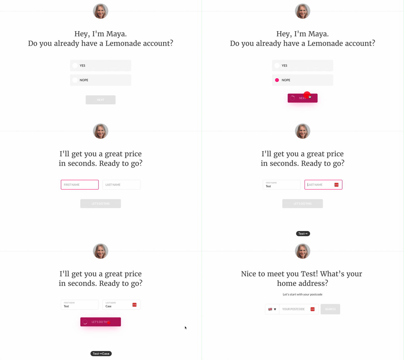
We like this form’s casual tone of voice (“Yep”, “Nope”), bright CTAs and visual sense of progress.
We would probably test better inline validation on this form (it’s possible to enter an invalid postcode, for example).
Nelu’s “fill in the gaps” contact form
This is a less common pattern: the interweaving of input fields with form text, to make a “fill in the blanks” type contact form.
In our opinion, these forms were fun when they appeared, but have quickly become tiresome (notice the 2017 deadline in this screenshot!).
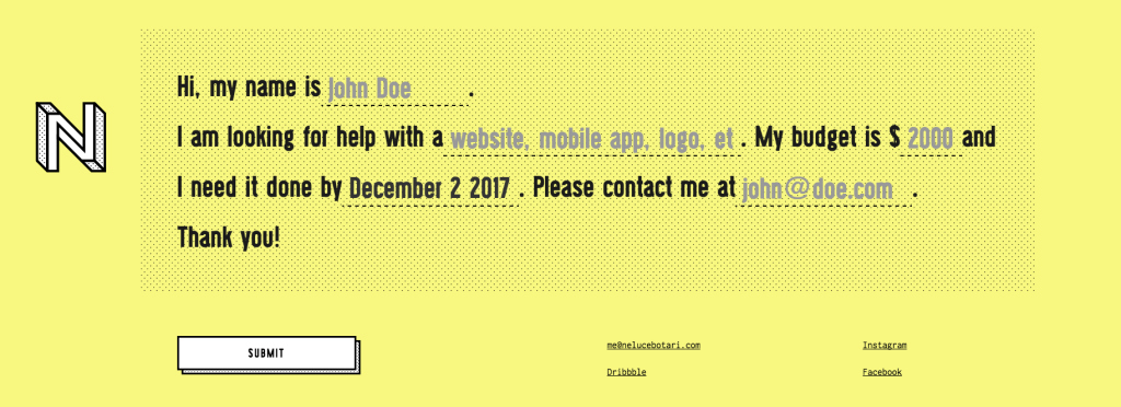
That said, these forms can be ideal if you have a strong brand statement to make, or want to really make users feel as if they’re talking to your brand.
Duolingo’s conversational onboarding
Bright colours, huge buttons – what’s not to love? Duolingo showcase bold, playful design in this simple conversational onboarding form example:
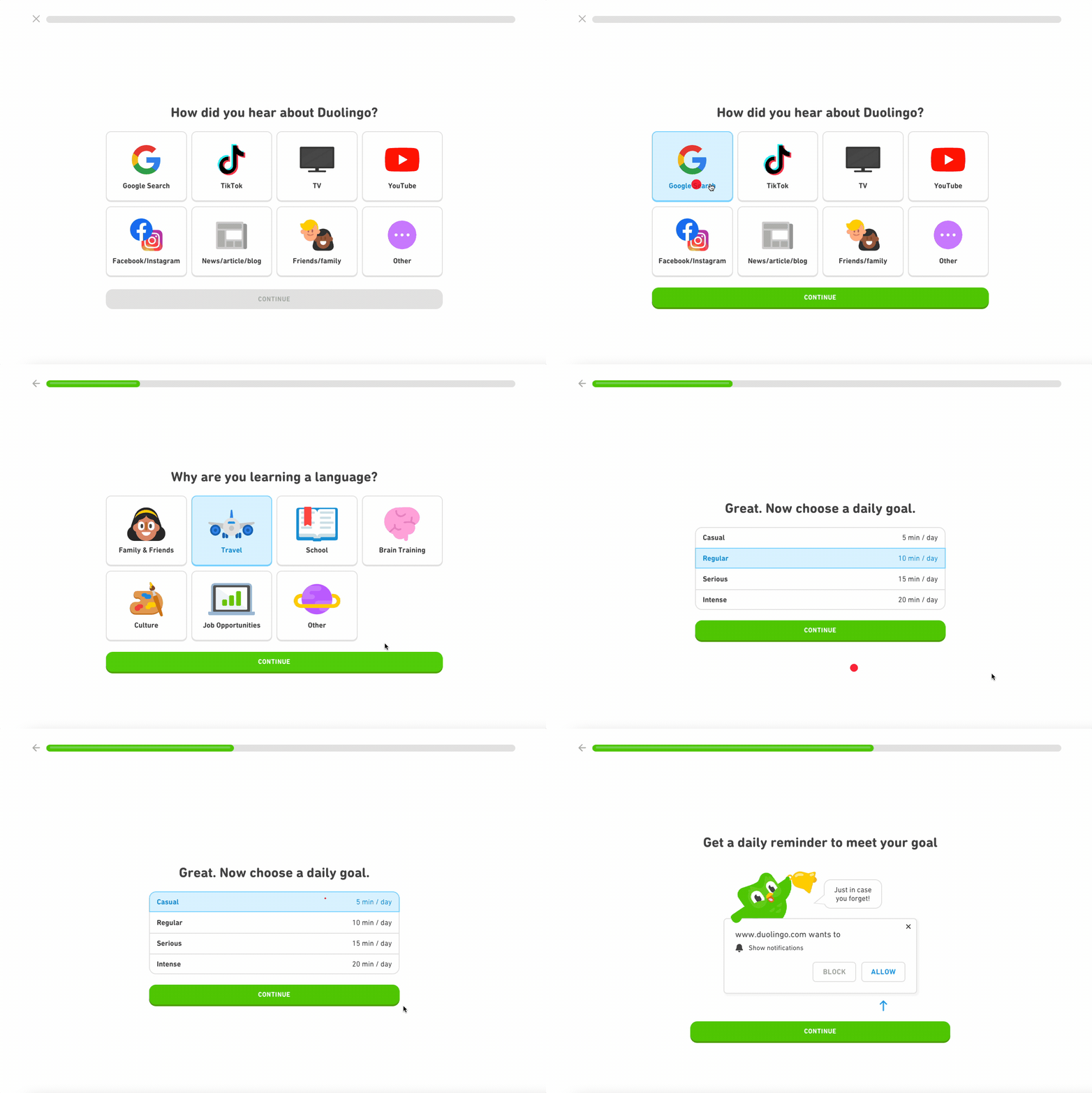
We like the excellent sense of progress, super straightforward design and carefully picked questions.
No doubt this form has been through plenty of A/B testing – but we’d probably try asking more benefit-driven questions first (“How did you hear about us” is a little “us” focused for the first question!).
Best Practices for Designing Effective Conversational Form UX
When designing your conversational form, keep these best practices in mind to ensure a seamless and enjoyable user experience:
- Keep it simple: Avoid overwhelming users with too much information or too many options. Focus on asking the most important questions and use progressive disclosure to reveal additional information as needed.
- Use clear, concise language: Write your conversational copy in a clear, conversational tone. Use simple language and avoid jargon or technical terms that may confuse users.
- Provide context and feedback: Ensure that your conversational form provides users with the necessary context and feedback to understand what is happening and what is expected of them. Use clear instructions, error messages, and confirmation messages to guide users through the process.
- Design for mobile: With more users accessing the internet on mobile devices than ever before, it’s crucial to design your conversational form with mobile users in mind. Use adaptive design to ensure that your form is optimized for various screen sizes and input methods.
- Test and iterate: As with any user experience design, testing and iteration are essential for creating an effective conversational form. Test your form with users to gather feedback and identify areas for improvement, then make adjustments and continue to iterate until you achieve the best possible user experience.
When Not To Use Traditional Online Forms vs Conversational Forms
While conversational forms can be a powerful tool for engaging users and collecting information, there are some situations where they may not be appropriate.
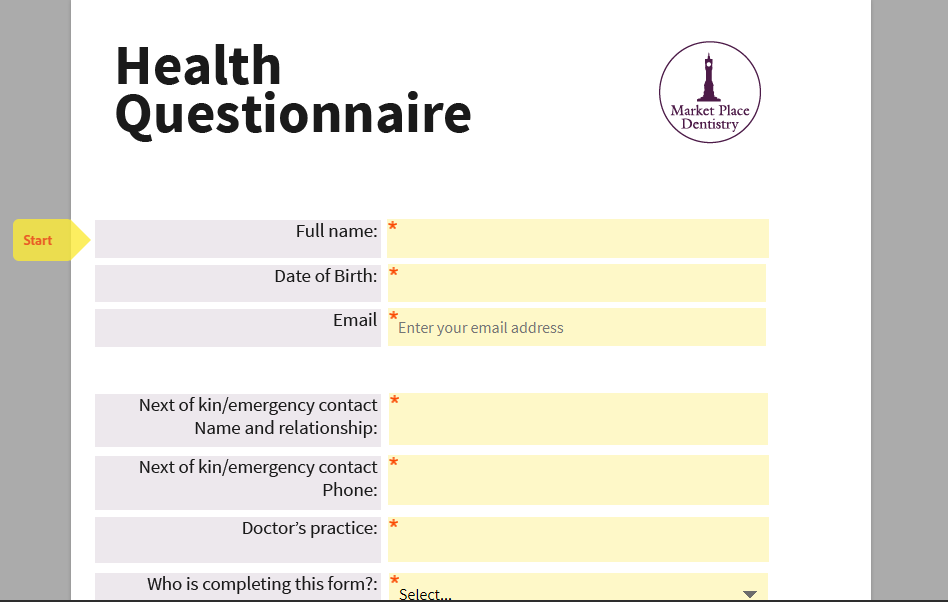
Here are a few examples:
- When user inputs are complex: If the information you are collecting requires complex or technical input, a conversational form may not be the best approach. In these cases, it may be more effective to use a traditional web form or provide users with a more detailed explanation or tutorial.
- When users are in a hurry: Conversational forms can be engaging and enjoyable, but they can also be time-consuming. If users are in a hurry or need to provide information quickly, a more streamlined form may be more appropriate.
- When users have accessibility needs: Conversational forms may not be accessible to all users, particularly those with visual or motor impairments. In these cases, it’s important to provide alternative means of input and ensure that all users can access the information they need.
How to Create Conversational Forms: Step-by-Step Guide
To create a conversational form using Growform, follow these steps:
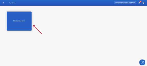
Step 1: Sign Up and Create a New Form
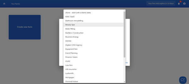
Begin by signing up for a Growform account. Once logged in, click on “Create new form” and select a template that suits your needs. Growform offers a variety of high-converting templates tailored for different industries.
Step 2: Customize your Form Fields
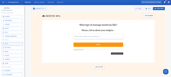
Use Growform’s drag-and-drop builder to add, remove, or modify form fields. You can include various field types such as text inputs, single select options, and more. This flexibility allows you to design a form that aligns with your specific requirements.
Step 3: Set up conditional logic
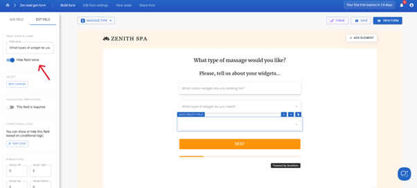
Implement conditional logic to show or hide certain questions based on user responses. This feature ensures that users are only presented with relevant questions, enhancing the conversational experience.
Step 4: Design the form’s appearance
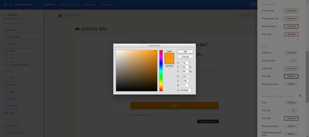
Customize the form’s appearance to match your brand by adjusting colors, fonts, and button styles. Growform provides extensive styling options, including the ability to use custom CSS for advanced customization.
Step 5: Embed the form on your website
Once you’re satisfied with the form’s design and functionality, embed it into your website. Growform offers straightforward embedding options compatible with various website builders, including WordPress and Unbounce.
By following these steps, you can create an engaging conversational form using Growform without the need for coding expertise. This approach streamlines the form creation process and allows for easy maintenance and updates over time.
Introducing Growform, the form builder that gets you more leads
If you’re creating a conversational form, you’ll need a good conversational form builder.
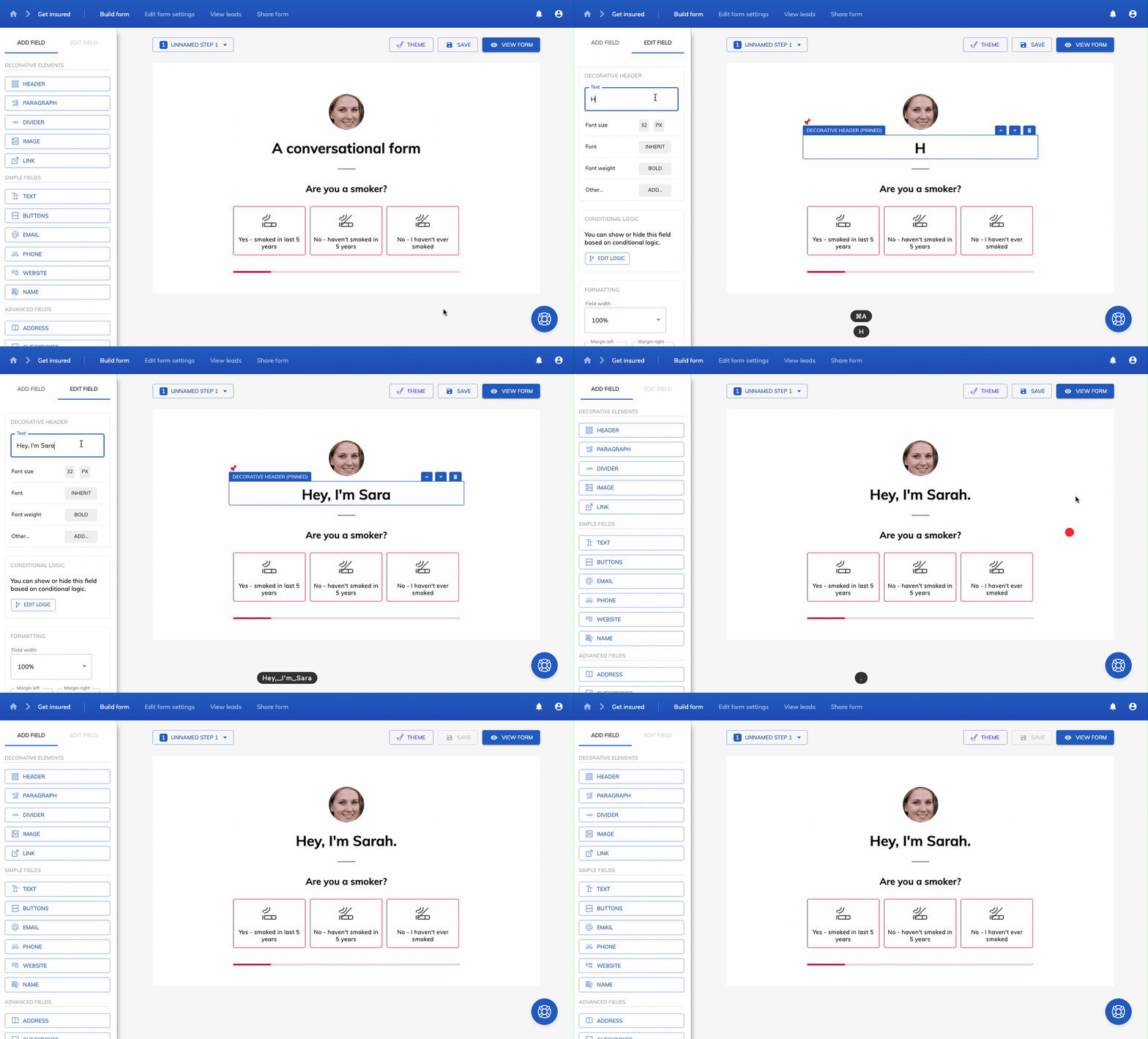
Growform was built from the ground up to boost conversion rates, and will let you create beautiful conversational forms that look great on any device:
There’s a 14 day free trial available, and the tool lets you send you send your leads pretty much anywhere (including via email or to your CRM) using Zapier.
Recent Posts
- Anatomy of a Landing Page: 12 Essential Elements for Higher Conversions
- 8 Best Webinar Landing Page Examples to Boost Signups
- 10 Best ClickFunnels Landing Page Examples That Actually Convert
- How to Improve Landing Page Optimization and Boost Conversions
- Landing Page Metrics That Matter: 12 KPIs to Boost Conversions
