5 Little Known Unbounce Hacks To Boost Your Conversion Rate
If you’re reading this blog post, it’s likely that you’ve already discovered the power of Unbounce, a fantastic tool that enables anyone – even those without a technical background – to create stunning, high-converting landing pages without having to write a single line of code.
But have you really pushed it to its limits?
Are there hidden gems within the Unbounce platform that could help take your landing pages from “great” to “extraordinary”?
Yes, and we’ve found them!
In this article, we’ll show you 5 of the more obscure but effective Unbounce tricks and tips to really squeeze the most out of your landing page…
Table of Contents
A simple primer on conversion rate optimisation
Before we get started, let’s take a few seconds to recap the fundamental conversion rate optimisation (CRO) principles.
The LIFT model succinctly and visually describes the levers we can use to create a high performing landing page:
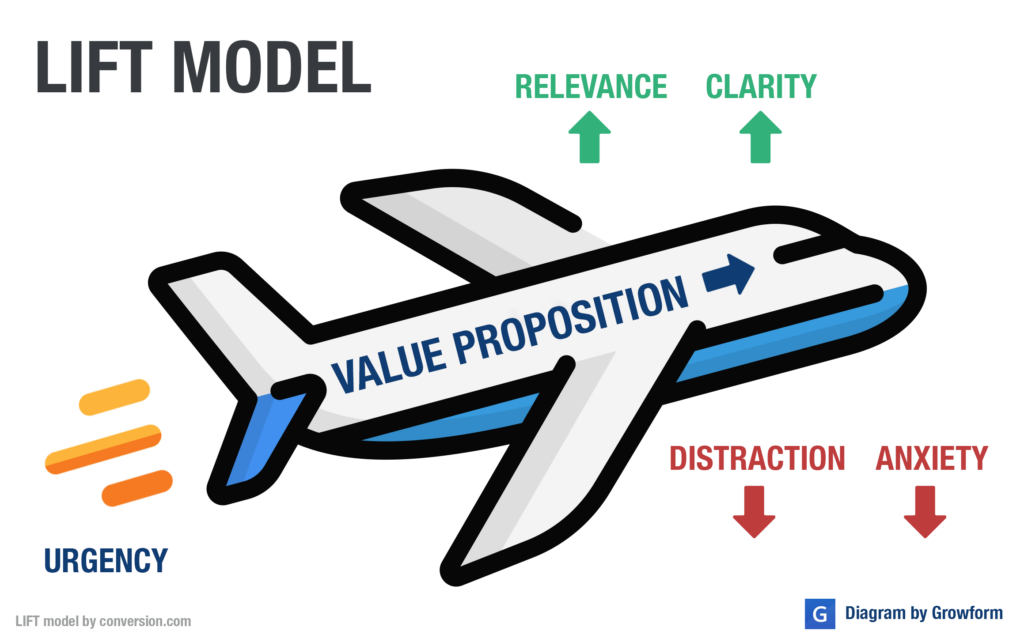
In other words: We wish to show a clear value proposition whilst adding urgency, relevance and clarity. We should aim to reduce distraction and anxiety as much as possible.
We’ll be referring to these ideas throughout this article.
Without further ado, here are our 5 little-known Unbounce hacks you can use to boost your conversion rate…
5 – Add a fixed CTA, or “scroll resistant button”
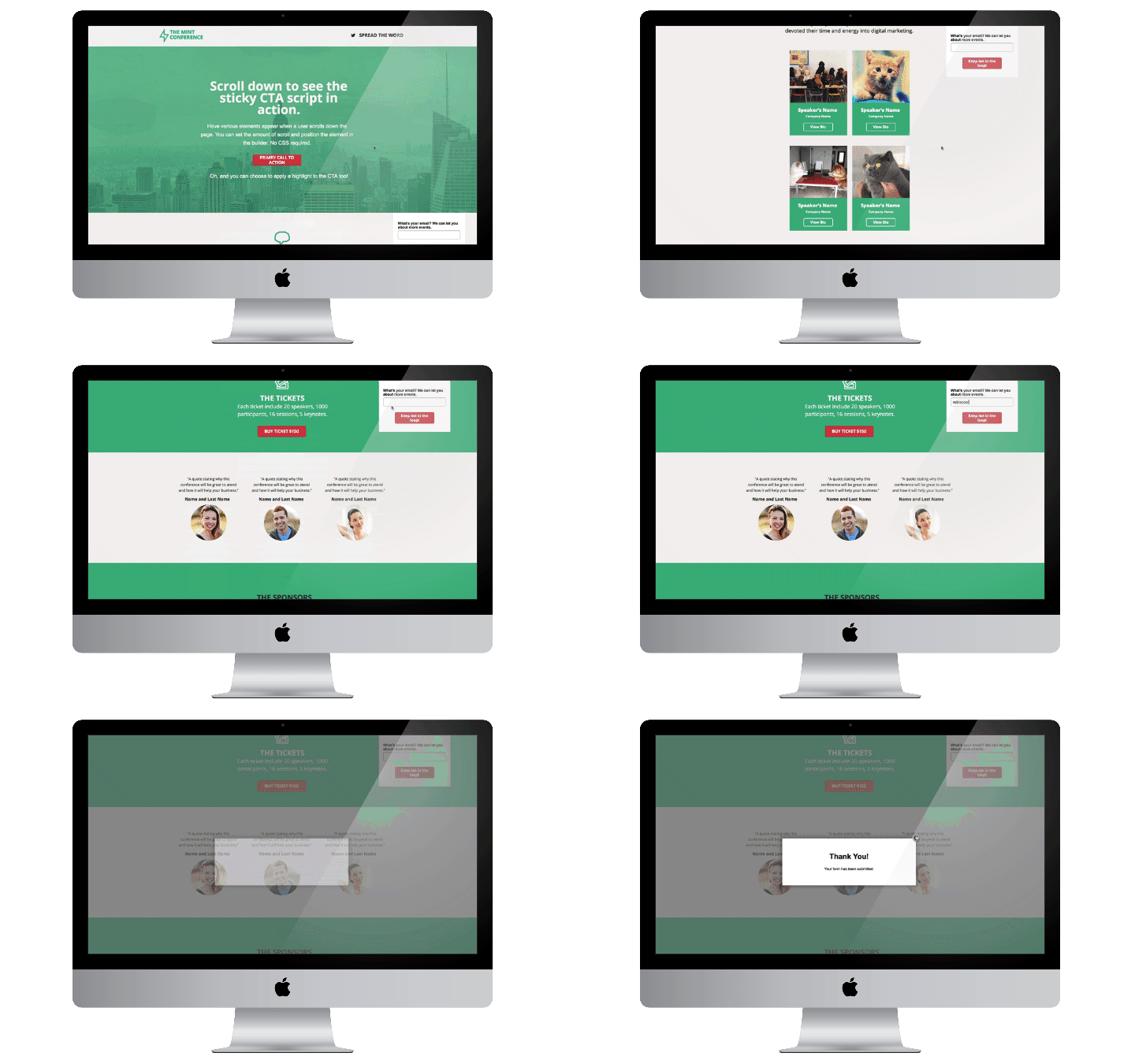
The theory behind having a fixed CTA is simple : the more we keep a button in front of users, the more likely they are to take action. By keeping the button in view at all times, we give our users more opportunities to take action.
Looking at our LIFT diagram, this trick works by reducing distraction and improving clarity. We’ve seen this trick used to great effect on conference registration pages and blog posts, but it can be used just about anywhere.
One word of warning though: it poses risks to the mobile experience (potentially covering up menus), so you shouldn’t use it on the mobile experience. If you’re wondering, it’s possible to separate mobile and desktop scripts in Unbounce.
Get instructions to add a fixed CTA here.
4 – “Count up” impressive stats with an animation
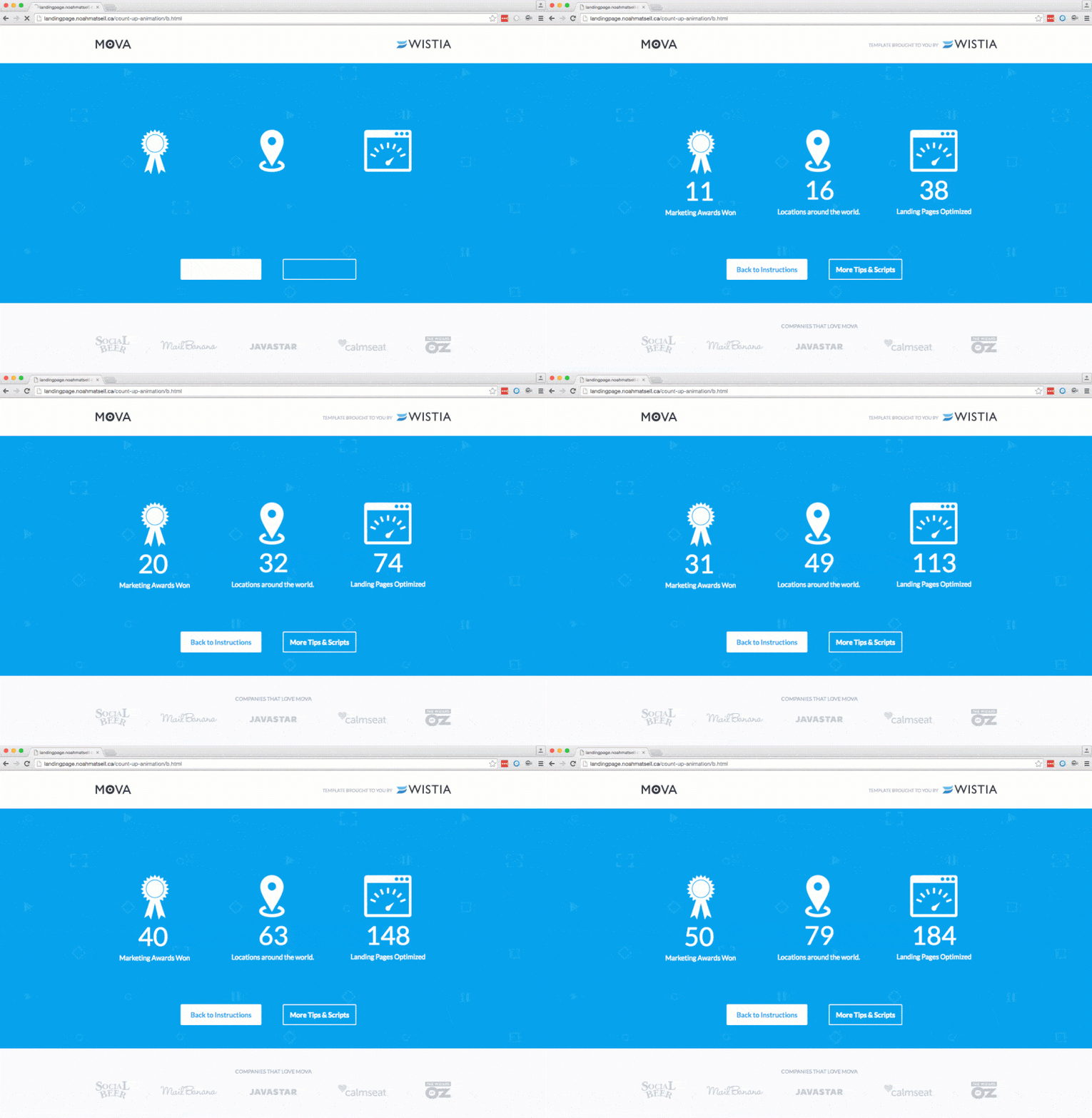
Even if you’ve been surfing the Internet from under a rock, you’ve probably seen a “counting up” animation at some point.
This follows the design principle of motion, and helps emphasise a particular statistic or number you want your users to see.
It’s easy to overdo it and end up looking like your website was designed in the early noughties, so we’d recommend using this tip sparingly.
Either way, we had to feature it here, as it shows how much can be done with Unbounce and a little custom script!
Get instructions to add a count-up animation here.
3 – Show the user’s location with Geotargeting
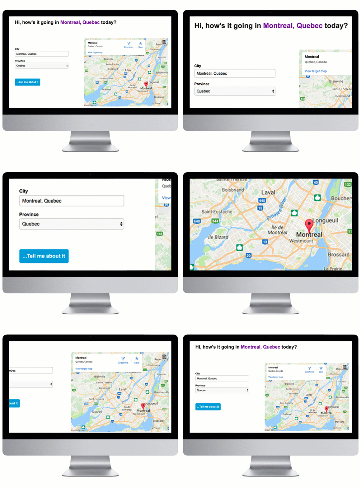
Have you ever landed on a website, seen something that indicates it’s aimed at a foreign audience and bailed immediately? Your users probably have, too!
It takes a split second to judge whether a landing page is relevant or not, and adding a little geotargeting can help make sure your users fall on the right side of the coin.
For example, let’s say you provide a nationwide interior design service, you could use this technique to create a banner that reads “Interior Design For Ontario”. Just make sure you really can deal with every location the user can see, and that it makes sense no matter where your users are located.
Get instructions to add your user’s location with geotargeting here.
2 – Convey multiple ideas with a typed effect
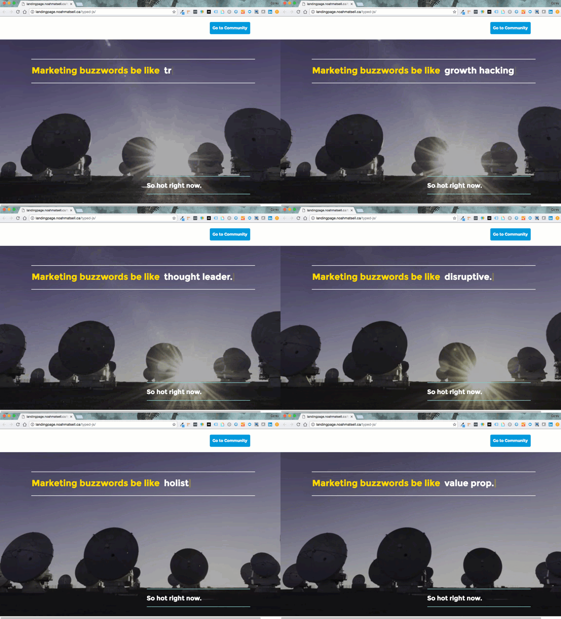
Like the “count up” effect we mentioned earlier, you’ve probably seen this somewhere on the Internet before.
This effect can dramatically improve relevance and clarity, boosting your conversion rate.
Let’s say you make software designed for marketers, product managers and sales leaders. By employing this effect, you can still call out each of these audiences without needing to choose one. No matter which audience your user is in, they’ll still feel “singled out” and appreciate the relevancy of the page.
Get instructions to add a “typed effect” here.
1 – Add multi step forms with Growform
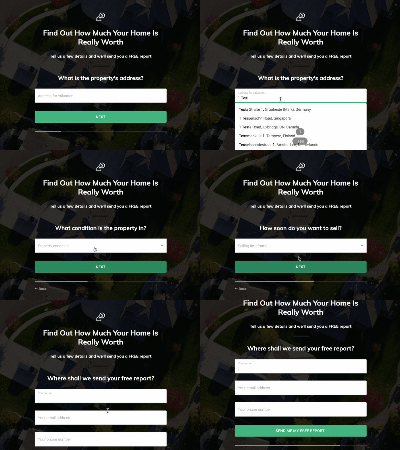
Multi-step forms are an extremely powerful way to boost your landing page’s conversion rate. We’ve seen plenty examples where splitting a form up into multiple steps can bring in up to 2x more conversions – not to mention resulting in better qualified leads.
Multi-step forms take advantage of the sunk cost fallacy – that feeling of “I’ve started this, so I may as well finish”. Referencing our diagram at the top of this post, they dramatically reduce anxiety/threat, and entice more users to start filling in your form.
Up until recently, creating a multi step form on Unbounce was extremely difficult – you’d have to string together various scripts and spend hours tweaking things to get them fields displaying just right. The need for features like conditional logic, validation and custom redirects made it pretty much impossible with custom code.
These days, Unbounce users can use Growform to create high-converting multi-step forms. There’s no need for hacky scripts, and it’s available on a 14 day free trial with no credit card required.
There are more detailed instructions here: how to add a Growform multi-step form to Unbounce.
Recent Posts
- Our Ultimate 7-Step Lead Qualification Checklist for Sales Success
- We Share Our Top Strategies to Help You Generate More Web Design Leads
- We Share 6 Effective Ways to Boost Lead Generation for Dentists
- We Reveal 7 Best Fintech Lead Generation Strategies to Drive Business Growth
- We Tried the Best Low-Code Form Builders for Hassle-Free Form Creation
