Helpful Summary
- Overview: We explain how we build and structure high-converting lead capture pages that generate real results.
- Why you can trust us: We’ve helped hundreds of businesses maximize lead gen with beautiful, simple lead capture forms.
- Why this is important: Great lead capture pages act as your first point of contact with potential customers and can significantly impact the success of your business.
- Action points: Start by thinking of a lead magnet that offers real value, then carefully build and iterate a page around that content.
- Further research: Check out the Growform blog for the best lead-capturing advice to support your lead-generation strategies.
Wondering How to Build a High-Converting Lead Capture Page?
Mastering the art of building great lead capture pages can be a game-changer for your business. A well-designed lead capture page helps convert visitors into leads, making it a vital part of your digital marketing strategy.
But how do you nail the setup, structure, and design? Growform has put together this comprehensive guide, which contains everything you need to know to design high-performing lead capture pages for any industry.
But first…
Why Trust Us?
Growform is your go-to platform for expert knowledge on building super-effective lead-capturing pages. We’re experts in helping businesses with 2X and 3X lead conversions through simple (but powerful) lead capture forms that embed almost anywhere and integrate with your favorite marketing tools.

We have years of experience in designing and optimizing lead capture pages, and we’re constantly analyzing trends and strategies to help our customers stay ahead.
What Is a Lead Capture Page?
A lead capture page (also known as a lead gen or “squeeze page”) is a type of landing page designed with one purpose—to convince prospects to give up their contact info.

This isn’t an easy task. People are reluctant to hand over contact details thanks to the abundance of spam emails, scams, and other pesky online annoyances. And, if you’re in the B2B space, it’s even harder to get leads to give up their work details.
That’s why most lead capture pages are built around lead magnets. These are valuable resources or offers that you use to incentivize the visitor to act. Think of things like ebooks, whitepapers, checklists, or webinars.
In short, the lead capture page is where the lead hands over their contact info to receive the offer— win-win!
How to Build a Lead Capture Page
1. Create a Lead Magnet
First on the agenda? Creating a lead magnet your audience won’t be able to resist. Typically, this is either a resource or an offer—think:
- Discounts
- Free trials
- Ebooks
- Checklists
- Webinars
- Whitepapers
- Strategy calls
The common thread is value. Each of these options offers value that incentivizes lead form submission, so choose something that your particular audience will find valuable. So start by brainstorming issues your target audience might face. What solution can you offer?
For example, one of Slack’s ideal customer profiles (ICPs) is companies looking to modernize and become more agile through technology. The main problem they face is simple—this transition is very difficult.
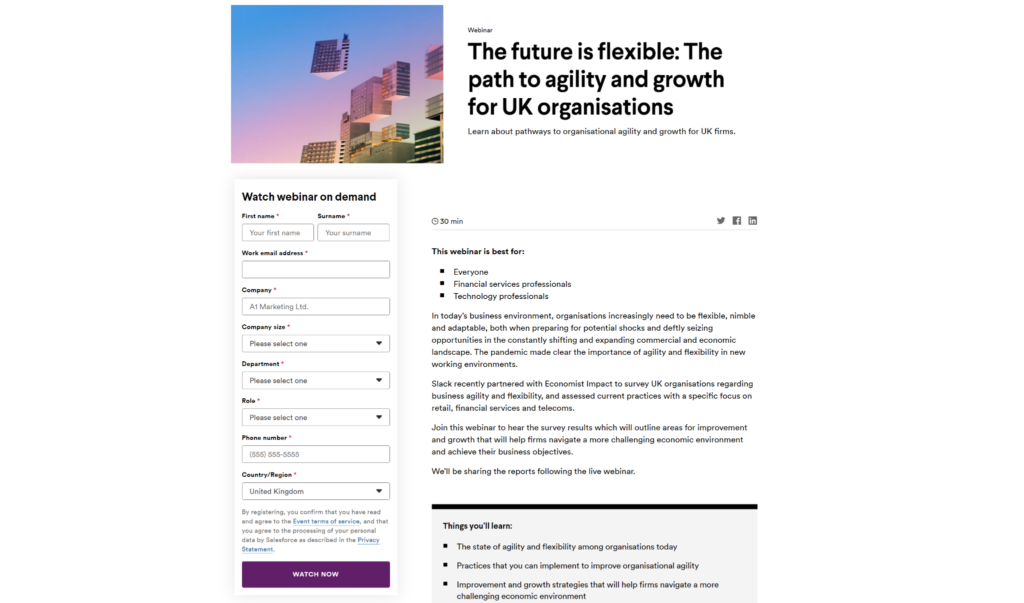
Based on this problem, Slack has created lead magnets (like this on-demand webinar on “the path to agility and growth for UK organizations”) to offer direct solutions.
2. Design a Simple, Focused Layout
A great lead capture page is simple. It needs to guide visitors to exactly where you want them to go without any distractions or clutter, sidetracking the process. So, it’s worth taking some time to carefully plan out the layout of your page.
Let’s start with the key on-page elements (we’ll cover a few of these in more depth later):
Hero

Every lead capture page needs a strong hero section that includes:
- A heading: A clear statement that tells visitors what they can expect to receive in exchange for their information.
- A subheading: A supporting statement that provides more context or details about the offer. We recommend keeping this very brief (>30 words ideally).
- A CTA: A button or link that users will click to take the next step and submit their information. It should be easily visible and contain action words.
- Visuals: Images, videos, or graphics that help reinforce the message and make the page visually appealing.
On-Page Copy
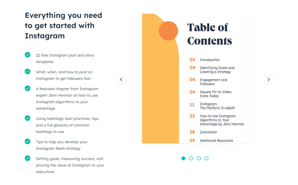
Below the fold (meaning not immediately visible when the page loads), you can include more information about your offer. This could include bullet points, a short paragraph, or even a testimonial from a satisfied customer.
Common on-page copy elements include:
- Benefits section
- “What You’ll Learn” sections
- FAQ sections
When you’re writing these, you want to balance brevity and detail. Your goal is to give users enough information to understand the value of your offer, while also keeping their attention and not overwhelming them with too much text.
If they see walls of text, they are going to become distracted from the offer—not good.
Lead Capture Form
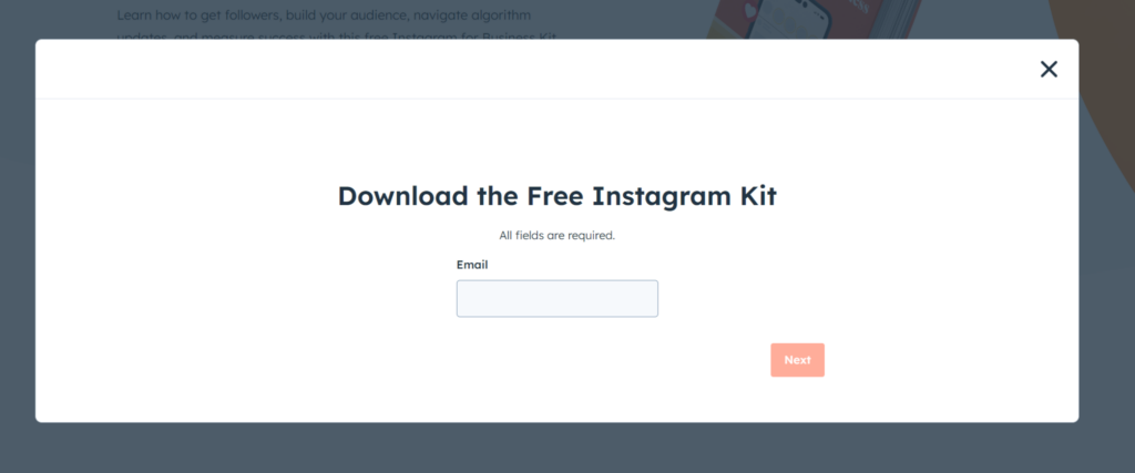
Somewhere on the page, you need to add a lead capture form. At a minimum, you need to be asking for names and emails. However, if you want more info to qualify leads as they roll in, you should think of additional questions to add.
We’ll cover this more in-depth below.
CTA

Depending on the page, you’ll probably also want a closing CTA. This one should expand a bit on the benefits of signing up and encourage users to act right away. Remember, the goal is to convert visitors into leads, so make sure your CTA is clear and compelling.
3. Use a Conversion-Focused Form Builder
Now it’s time for a deeper dive into one of the most crucial elements of a lead capture page—the lead capture form. Unless you build a custom solution for this, chances are you’ll be using a form-building tool. There are tons of options out there, but just be careful about choosing form builders that aren’t designed for conversions.
At Growform, lead gen and capture is what we do. Our forms are based on years of psychological and conversion data, so you can trust that they are optimized to capture more leads and increase conversions.
Here are a few features to look for:
- Multistep forms: Multistep forms are less daunting to users because they break down information into bite-sized pieces. The result? Fewer abandoned lead forms and skyrocketing completion rates.
- Conditional logic: This allows you to show or hide certain fields based on the user’s previous responses. This is a must if you have lead pages that target multiple ICPs, and don’t want to tank user experience (UX) by asking both the same set of questions.
- Customizable design: Your lead capture form should match your brand and be visually appealing to entice users to fill it out. With Growform, you get no-code customization and custom CSS
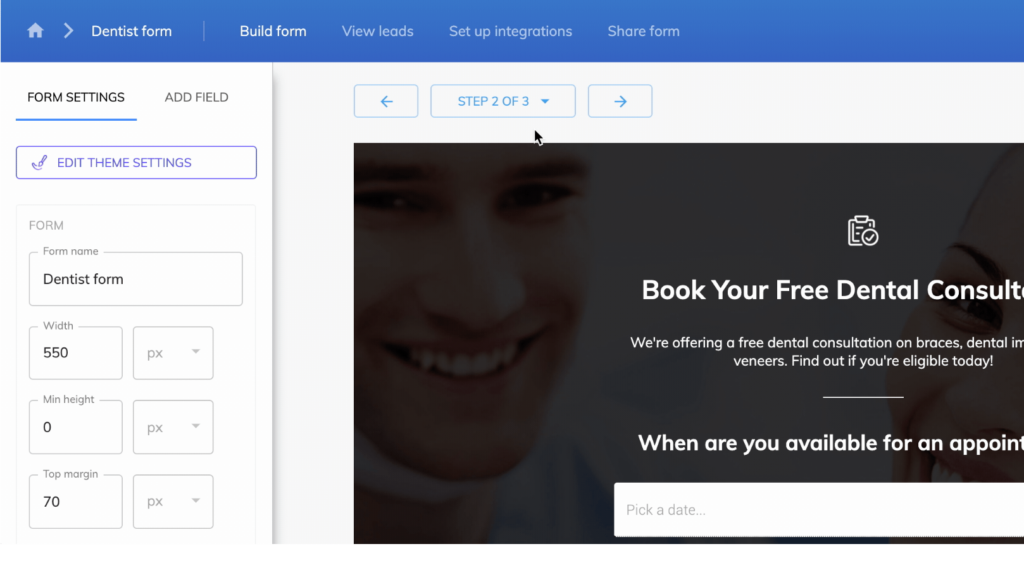
No coding skills? Not a problem. With Growform, anyone can create high-converting lead capture forms in minutes.
4. Establish Trust and Credibility
Another way to accelerate conversions is to sprinkle trust and credibility on your lead capture pages. It’s like a superpower for your site, reassuring visitors of rock-solid reliability and first-class expertise. As trust waivers, so too does their willingness to share information, so swap any chance of skepticism for confidence.
Here are some examples of how you can inject some trust and credibility into your page design:
- Customer testimonials and reviews: Include genuine testimonials and reviews for your happy customers. Their success stories and rave reviews offer a sneak peek into how your products or services can work for them.
- Trust badges and certifications: Showcase trust badges, such as SSL certifications, industry certifications, and security seals, to highlight your site’s safety and professionalism. This can make visitors feel safer sharing their information.
- Case studies and success stories: Share detailed case studies about how your clients have achieved victories with your offerings. Hearing about success from the horse’s mouth can catapult your visitor’s desire to become a part of these success stories.
5. Test and Iterate Your Page
Lead capture pages are almost never perfectly optimized from the jump. Analyzing visitor and conversion data will help you diagnose issues that you can then iteratively fix to maximize conversions. The same goes for specific on-page elements (like your lead capture form).
Start with metrics to identify potential patterns. Look into things like:
- Bounce rate: High bounce rates (compared to benchmarks or high-performing lead capture pages) may indicate that the above fold elements are not engaging enough or that your copy is confusing.
- Time on page: A high time on page may indicate confusing content. A low time on the page tends to highlight similar issues to a high bounce rate.
- Conversion rate: How many people are actually converting? If it’s not as many as you’d expect, you may need to rebalance the offer to provide more value.
Once you’ve identified an issue, you can form a hypothesis—“If I change X, then Y will improve.” These hypotheses can then be tested with A/B and multivariate testing.

A/B testing is especially powerful for testing different headlines, CTAs, images, form fields, etc. Using real-world conversion data, you can see which version your audience prefers and make changes confidently.
Conclusion
Building an effective lead capture page can transform your business by converting passive visitors into potential customers.
It requires a clear understanding of your audience, crafting compelling value propositions, designing focused layouts, an actionable CTA, and building trust and credibility. The ability to A/B test your page to continuously adapt and improve means no more guess-work about what’s hot about your design and what’s not.
Using a powerful form builder like Growform can boost your quality leads by up to double. So, when you’re ready to maximize form completion rates, sign up for a free 14-day free trial and see the difference for yourself.
